Didn't Feel Like One Platform
Each product had its own branding and UI patterns instead of one consistent look-and-feel.
Business Impact:
Undermines the sense that this is one connected product, not four bolted together
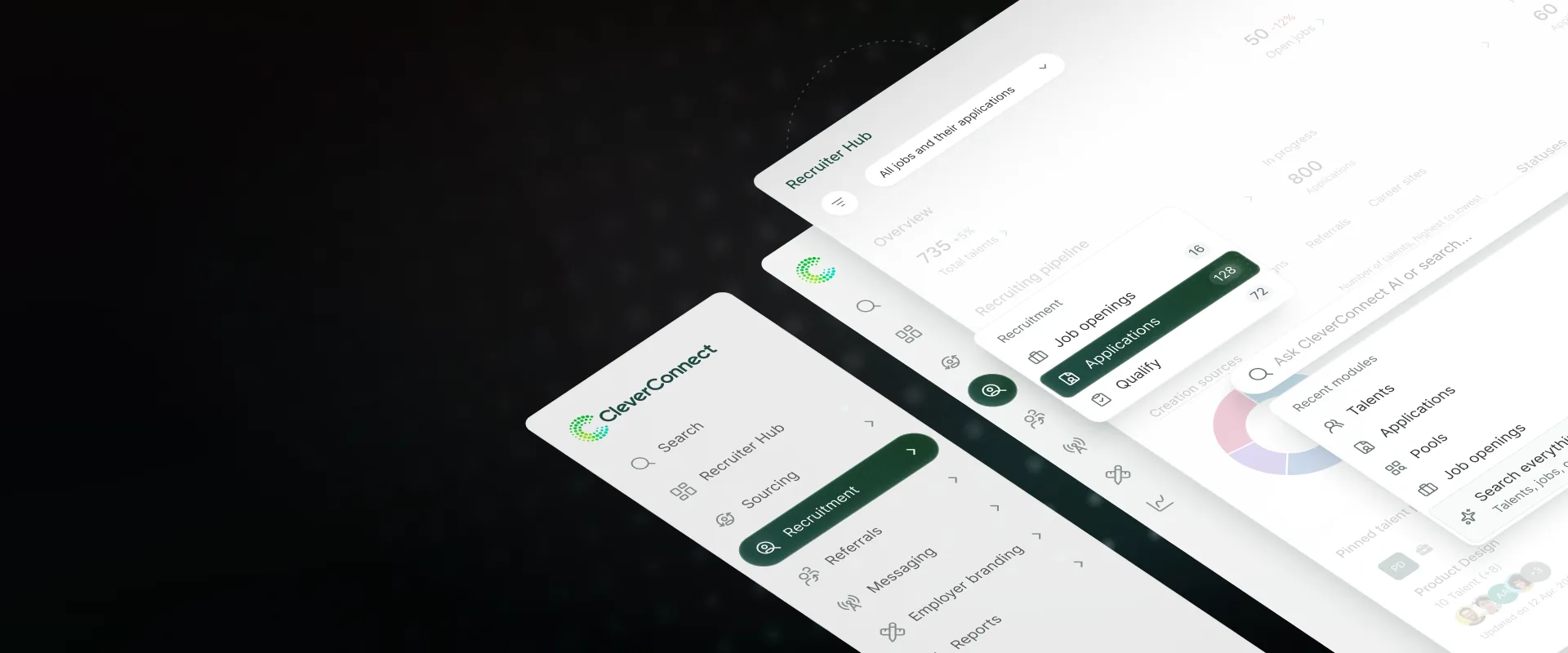
Consolidated fragmented navigation across 4 products into a single nested schema built to scale past 20+ product areas, to be validated through tree testing before rollout.
| Problem | Post-merger, leadership wanted to 'platformize' the product suite, with no shared definition of what that meant or how to execute it |
| Goal | Reframe platformization into a validated, scoped problem, then design its navigation and IA half |
| Outcome | Designed and delivered a consolidated nested navigation schema, to be validated via tree testing with internal recruiters before rollout |
| Role | Project lead; reframed and scoped the initiative, aligned with the ex-COO (Talentry's founder) and VP of Product |
| Timeframe | Dec 2025 - Jan 2026 (Design phase) |
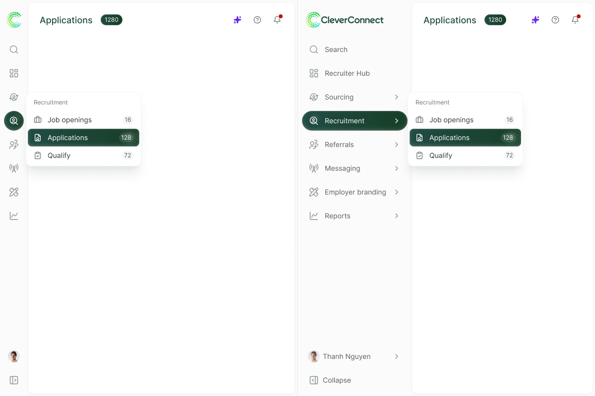
Navigation bar, collapsed by default, expands on demand
CleverConnect and Talentry had merged years earlier, but the products still didn’t operate like one platform.
4 products from different roots, 20+ product areas, 2-3 personas. Leadership’s ask was directionally right, but light on specifics.
No shared definition of what “platformization” meant, or how to execute it.
Around the same time, a separate initiative was underway to grow revenue through cross-sell and upsell across the 4 products.
I connected the two: platformization was also the means to advertise the offering and unlock that cross-sell (aligned with the ex-COO (Talentry’s founder), and later, our VP of Product).
The data backed it up: about three quarters of customers used only 1 of the 4 products, and just a quarter had adopted 2+.
Almost no one was using the platform as a platform.
Two blockers within design’s control:
Each product had its own branding and UI patterns instead of one consistent look-and-feel.
Undermines the sense that this is one connected product, not four bolted together
Customers using one product had no way to see the others.
Use nav as a natural place to test demand, a click on a locked area is a real signal.
With the problem validated, I scoped platformization into two workstreams:
Unifying how products look and feel. Tackled separately, in an ongoing initiative.
Unifying how products connect and are discovered. The focus of this case study.
The visual system half is covered in One Design System for Every Stack. This case study covers the navigation and IA half.
Customers switching between products had to relearn the interface every time.

Talentry’s original navigation (CRM / Referrals)
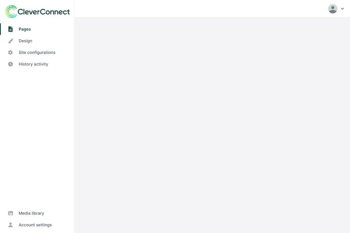
CleverConnect’s original navigation (CMS)
Talentry (CRM and Referrals) nav became the platform’s core. Qualify, being the newest product, was integrated deeply into this nav system.
CMS, on the other hand, is just a link appended to the core nav that opens CMS in a new tab, a cheap intermediate fix never meant to be permanent.
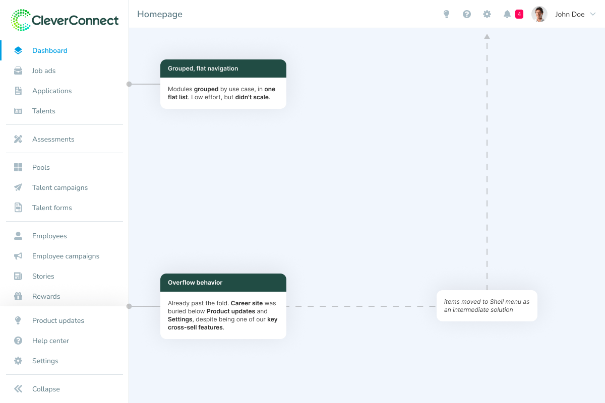
The flat sidebar, annotated where the list runs long enough to overflow past the fold
As new items were added to the list, it started overflowing vertically on standard laptop screen sizes. As a quick workaround, we moved settings and help into a shell menu in the top right to claw back vertical space.
We needed a structure that could accommodate cross-sell, upsell, and future product growth, while bringing the platform’s products closer together in UX.
Flat was already breaking → nested became the next logical step.
That still left one real decision: group by use case vs. by product, each dictates its own layout.
| By Use Case / Dropdown ✓ | By Product / Double Vertical | |
|---|---|---|
| Mirrors | Actual user workflow | Legacy product division |
| Familiarity | Matches industry-standard mental models, but reshuffles where legacy power users expect things, to be validated via tree testing | Familiar to existing single-product users, doesn’t scale to new customers |
| Cross-sell | Upsells surface inside the workflow they’d add value to, relevant to what the user is actively doing | Only surfaces generic other-product ads, disconnected from the user’s workflow, weaker on buying intent |
| Overlapping features | One home per capability, no matter which product built it | The same capability may be in more than one place, unclear if duplicate or different tool |
| Screen real estate | One collapsible rail | Two columns, tight on 13-14” laptops |
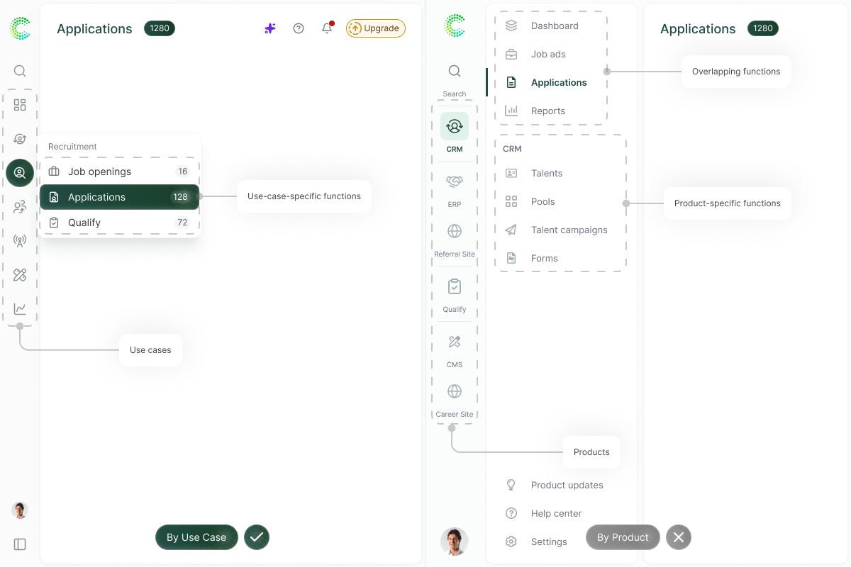
By Use Case + Dropdown (chosen) vs. By Product + Double Vertical (rejected)
The known risk with a nested approach, regardless of IA, is discoverability: what used to be 1 click can now cost 2. We offset that two ways:
Surfaces any feature instantly, regardless of where it's nested.
Let users jump laterally within their active workflow without backtracking through the rail.
Top-level search + breadcrumbs so nothing gets buried
One shared recruiter experience across 4 products
Sections named using industry-standard use cases
The nav collapses to an icon rail by default, expanding to show section names on demand.
Collapsed by default, expands on demand
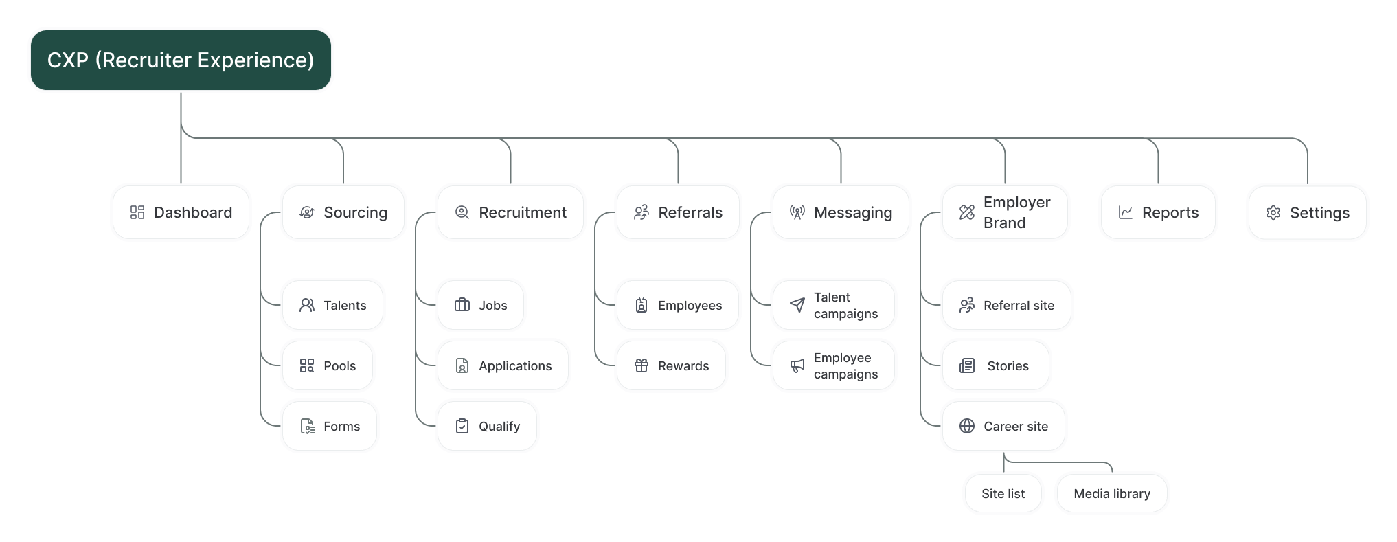
The final IA: 8 top-level sections, each grouping 2-3 related modules
Clicking search opens a Spotlight-style overlay, suggesting modules by recency of use, plus a fake-door artifact-search button to gauge interest before investing further.
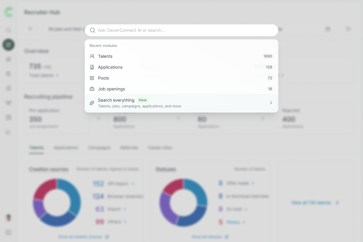
Search dropdown, sorted by recency of use. The artifact-search button is a fake-door test.
At the second level, breadcrumbs let users jump between sibling and parent sections without backtracking through the rail.
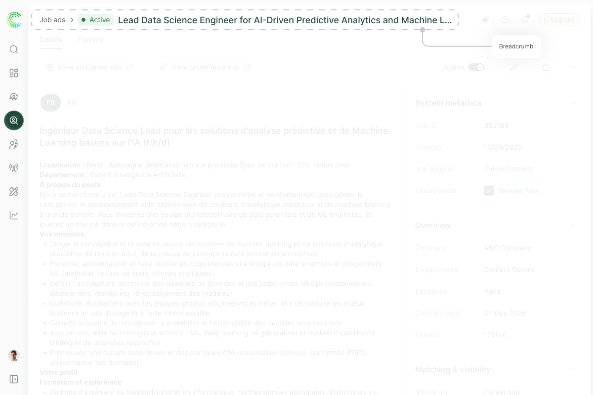
The breadcrumb trail, shown at the second level of the IA
Locked modules carry an upgrade badge and stay clickable, opening a full-screen upsell instead of a dead empty state.
Each click also doubles as a demand signal, and a test of the underlying hypothesis: if discoverability was the blocker, surfacing locked modules should generate clicks; if customers simply don’t want the other products, clicks won’t come.
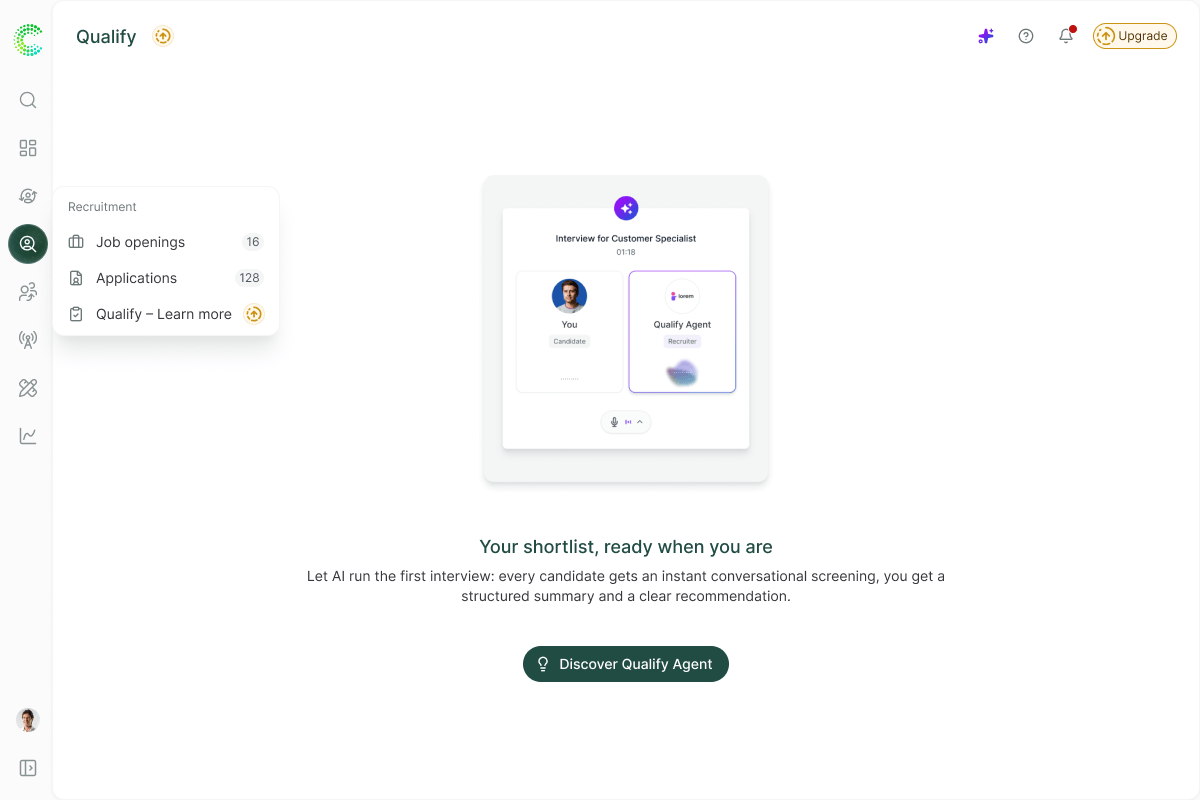
Locked module, badged and clickable. Click opens a full-screen upsell
Tree testing is planned with internal recruiters (domain-representative users who work in recruiting daily but don’t know the platform’s structure) to check whether use-case sections are findable before customer-facing rollout.
Success bar: every section must be findable by testers without help; any repeated miss triggers a rename or regroup before rollout.
Tree testing and IA iteration are queued alongside engineering rollout, pending prioritization against other platform work.
Run tree testing and iterate on the IA based on findings.
Engineering scoping.
Prioritize a phased rollout across nav, breadcrumb, and search.
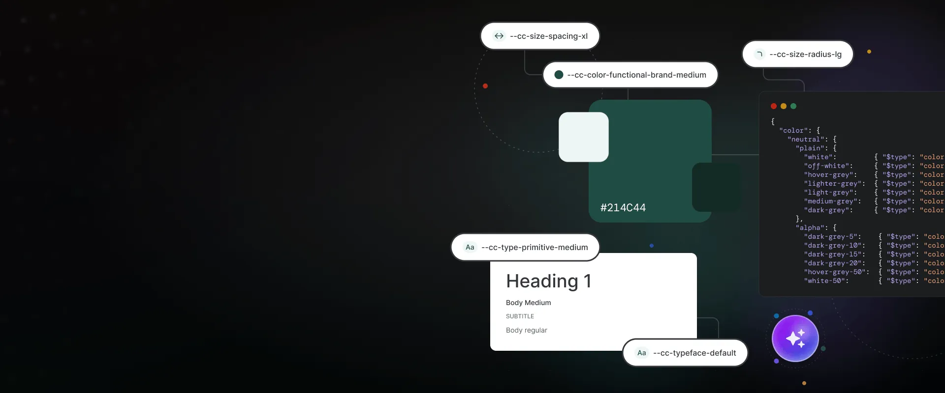
Built a framework-independent design system solo with AI-assisted coding, laying the foundation to cut UI regressions and QA effort across product teams.
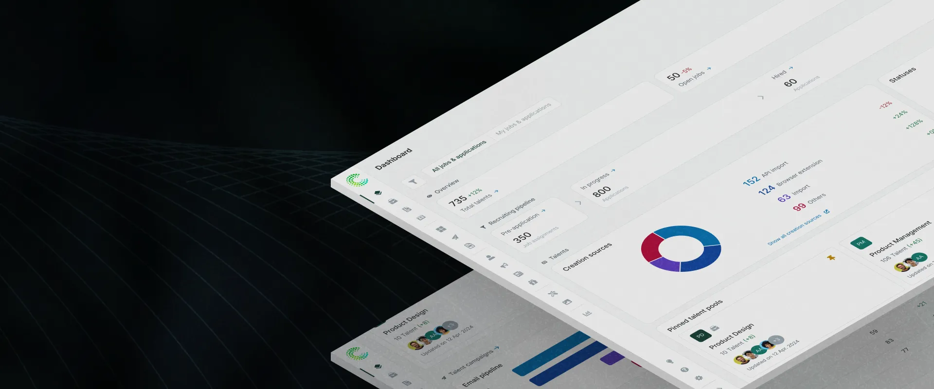
Redesigned recruitment analytics around trust and workflows, taking dashboard engagement from effectively zero to a sustained 7.1%, and setting the dashboard standard across product squads.
New upgrade flow helped users find premium features and boosted conversions 12.7% in 10 weeks
A redesign case study with positive user feedback and improved design-to-dev handoff.