Quantified the Damage
I audited the Figma library against production and dug into usage data. The goal was to show exactly where inconsistencies were costing us time and identify the most valuable fixes.
A redesign case study with positive user feedback and improved design-to-dev handoff.
| Problem | An outdated, inconsistent design system was blocking feature releases and creating usability friction for non-technical users |
| Goal | Build a scalable design foundation that accelerates product development while improving usability for our core user base |
| Outcome | Reduced time-to-market for new features and improved customer satisfaction, validated through a 80% drop in UI bug/support tickets; Achieved 100% adoption across all product squads within 6 months |
| Role | Led end-to-end design system strategy: audited components, defined success metrics, prioritized roadmap with cross-functional stakeholders, and designed rollout plan with feature flags |
| Timeframe | Q2-Q4 2022 |
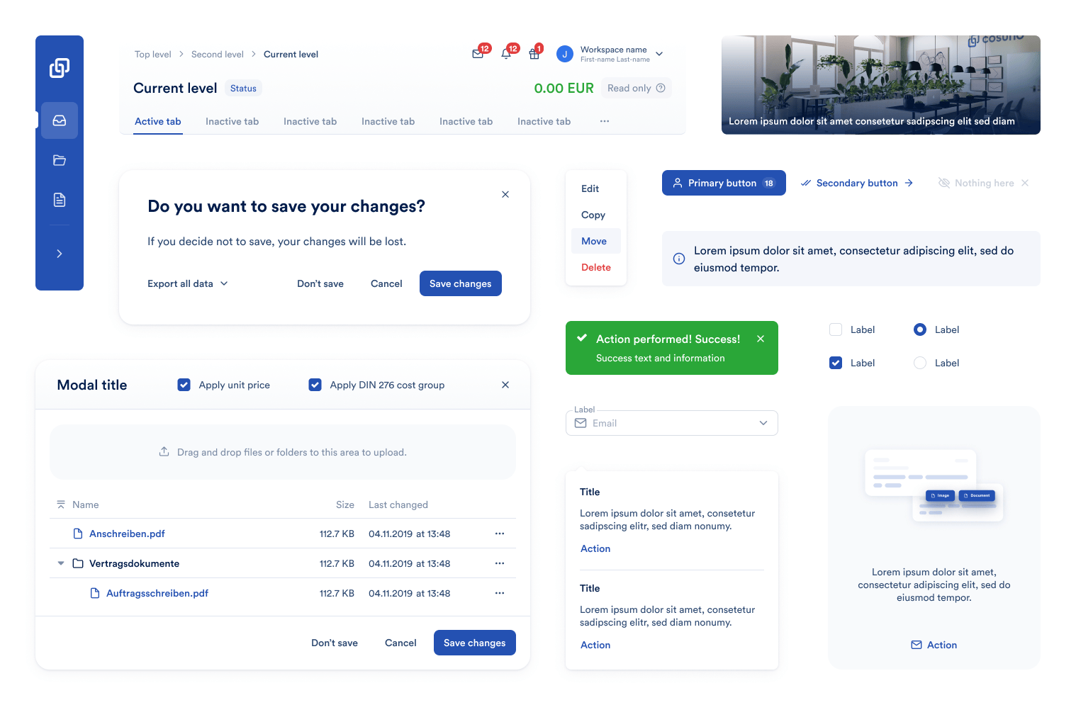
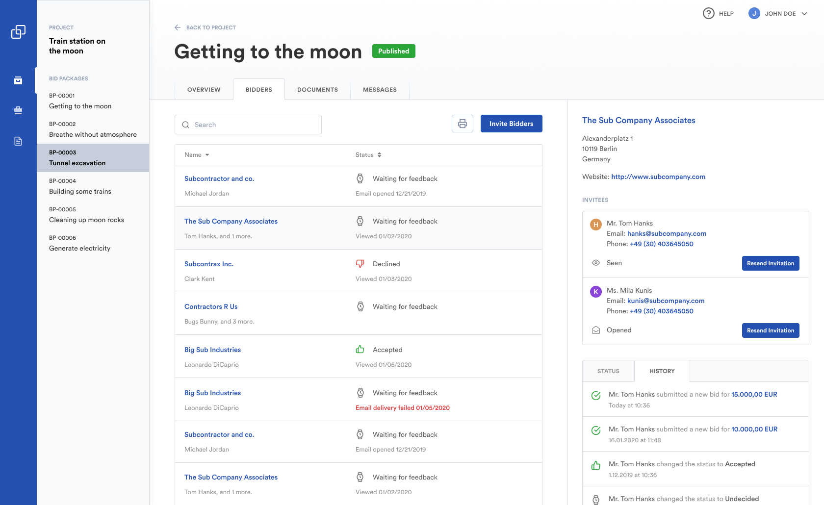
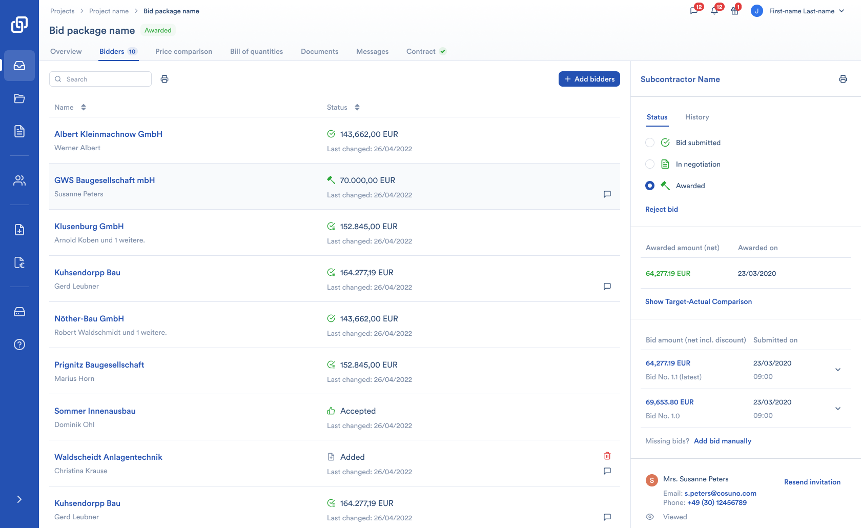
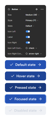
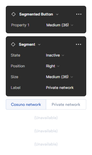
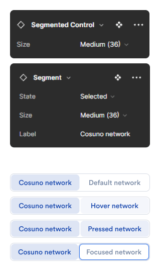
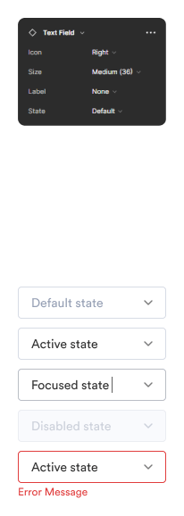
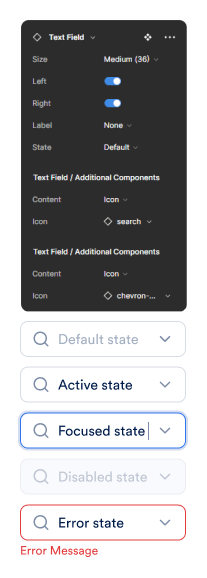
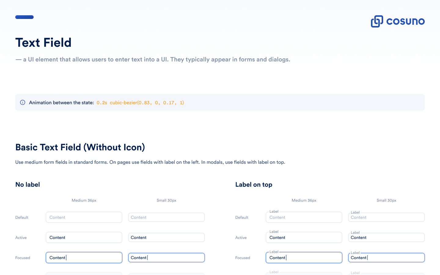
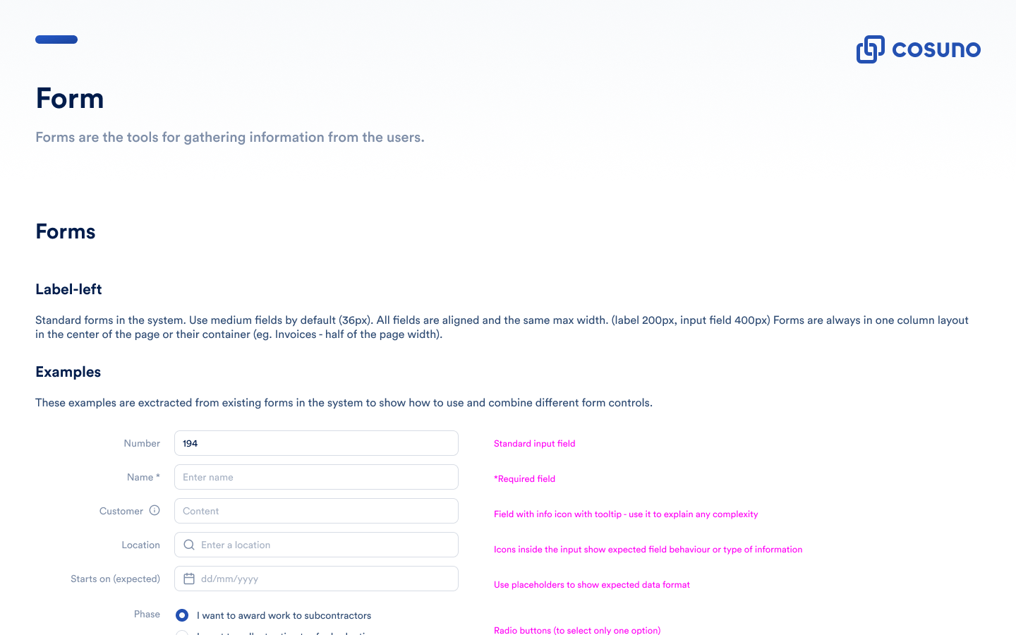
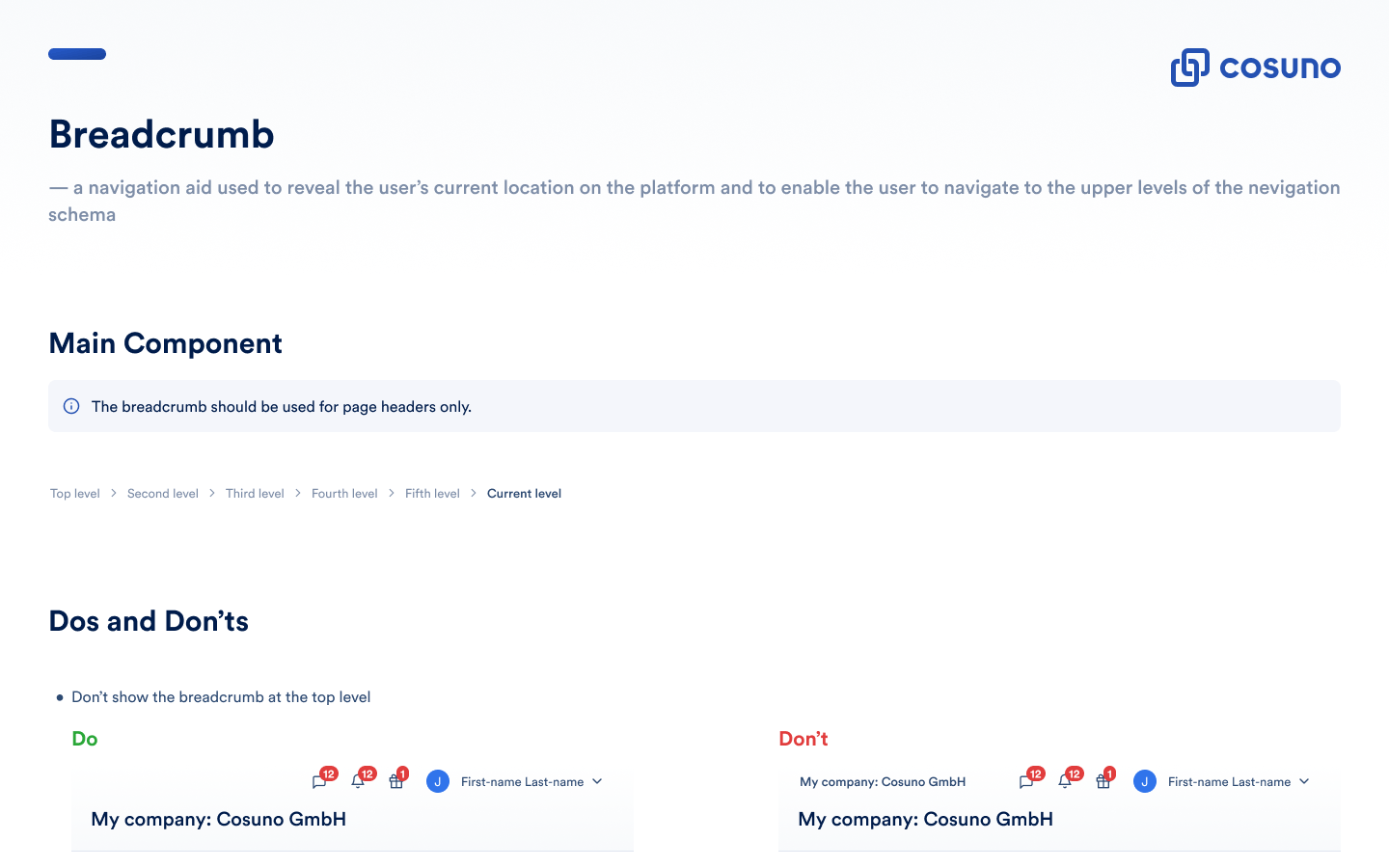
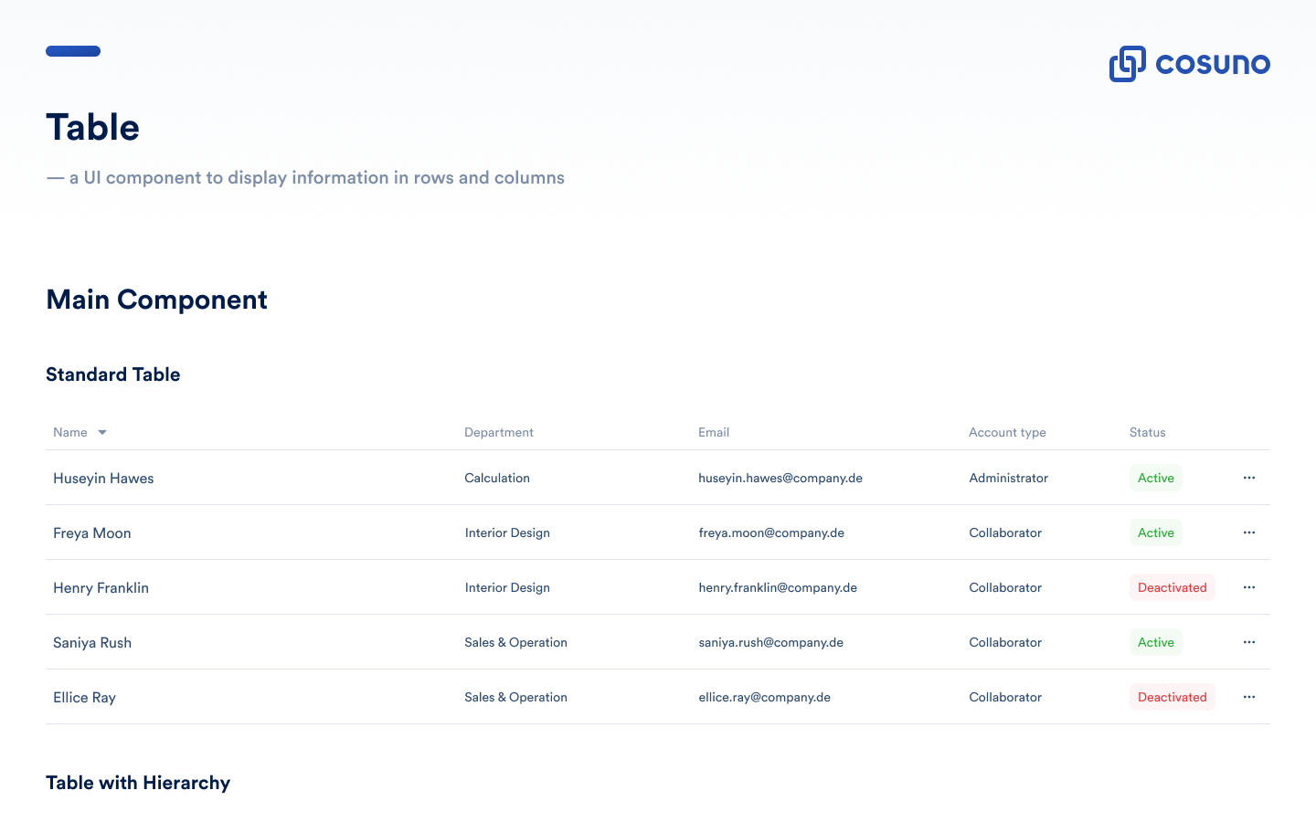
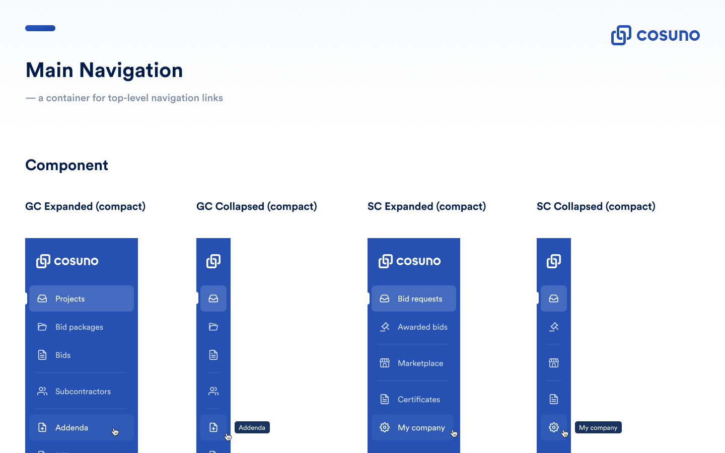
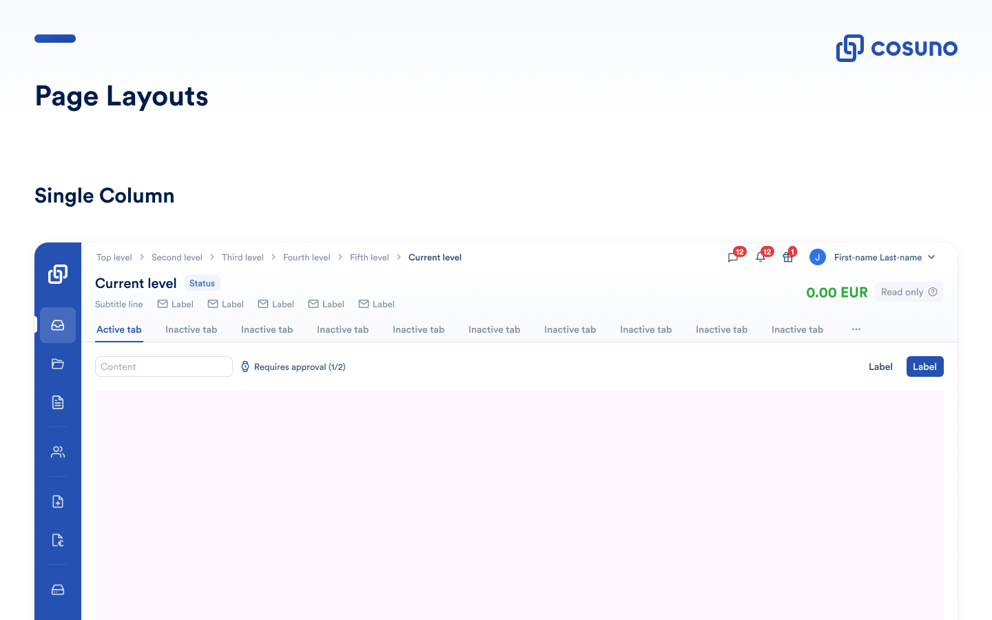
Design system components
The design component library was supposed to speed us up. Instead, it had become a source of bugs, slow handoffs, and team frustration. Our customers noticed the inconsistencies consistently.
Same UI bugs kept coming back. Handoffs took too long. Devs were losing trust in design specs.
The library and production had drifted apart. Missing a common source of truth.
Inconsistent UI patterns and UI bugs were harming the reliability our users expected from us.
To get buy-in from engineering and product leadership, we needed to frame this as a business problem, not a design exercise. Working with the Head of Design, I helped build the case: remove friction, ship faster, stay competitive.
I audited the Figma library against production and dug into usage data. The goal was to show exactly where inconsistencies were costing us time and identify the most valuable fixes.
We aligned on metrics with product and engineering leadership: keep customers happy during the migration while measurably improving delivery speed.
I worked with product and engineering to weigh technical effort against impact, as we couldn’t afford to rebuild the entire system at once.
Usage data showed 90% of work happened on large monitors 1080px+. Less than 10% of sessions were on smaller screens. Rather than build responsive patterns we’d rarely use, I focused engineering capacity on forms and data tables where users actually spent time. Mobile stayed on the backlog.
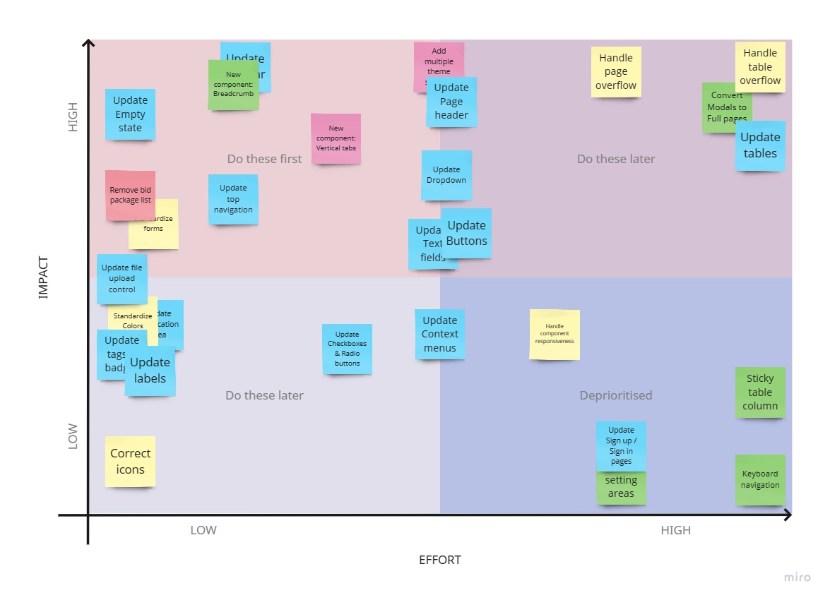
Value-effort prioritization matrix of the project
Platform changes are risky. We decided on feature flags to stage the rollout and recruited beta customers to catch issues before they hit everyone. This let us move fast without breaking things (much).
System-wide upgrade completed without issues
100% adoption rate across 3 product teams
Positive feedback and reduced UI-related support tickets
Faster development speed and smoother collaboration
Each squad owns their components → integrate DS into squad workflow → maintain 100% adoption rate
Design system becomes a mean to enable company-wide changes, not just a design deliverable
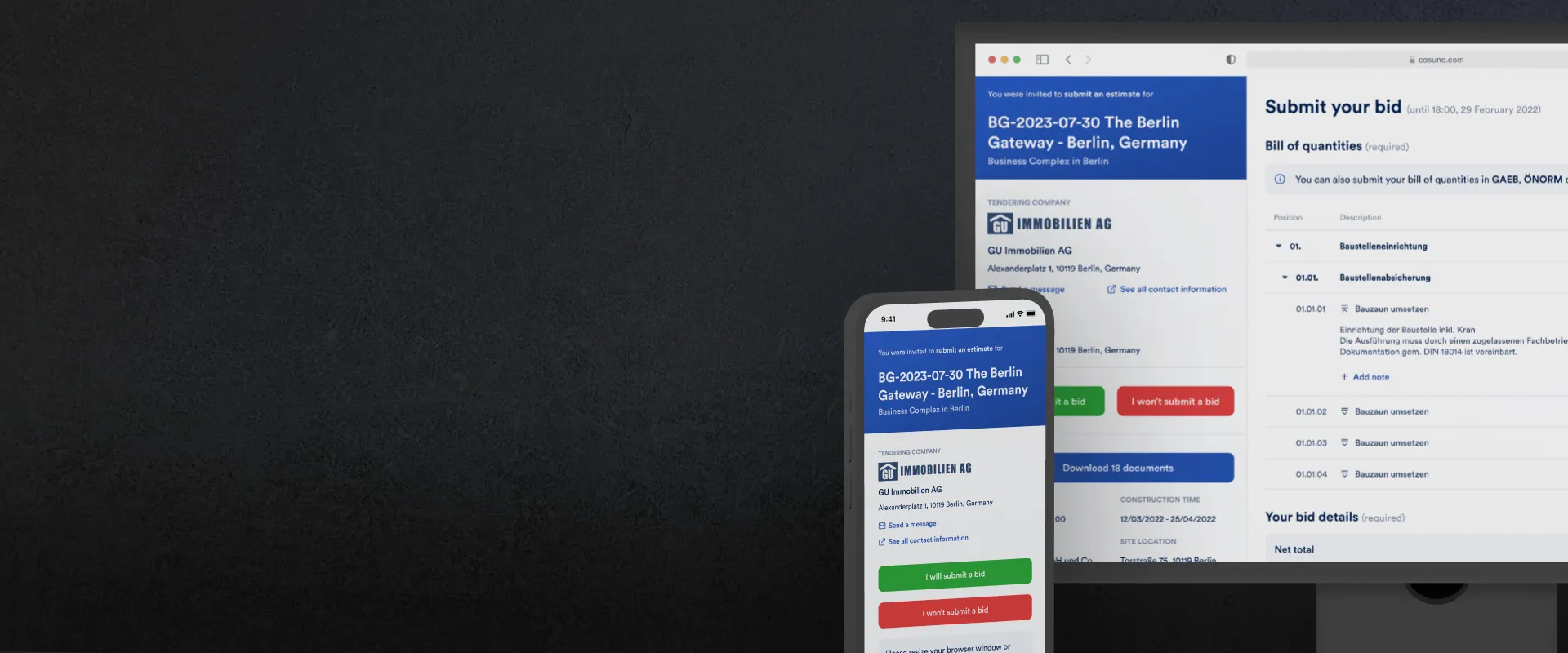
How better UX design increased construction bids by 20% and reduced data entry by 11% in B2B SaaS
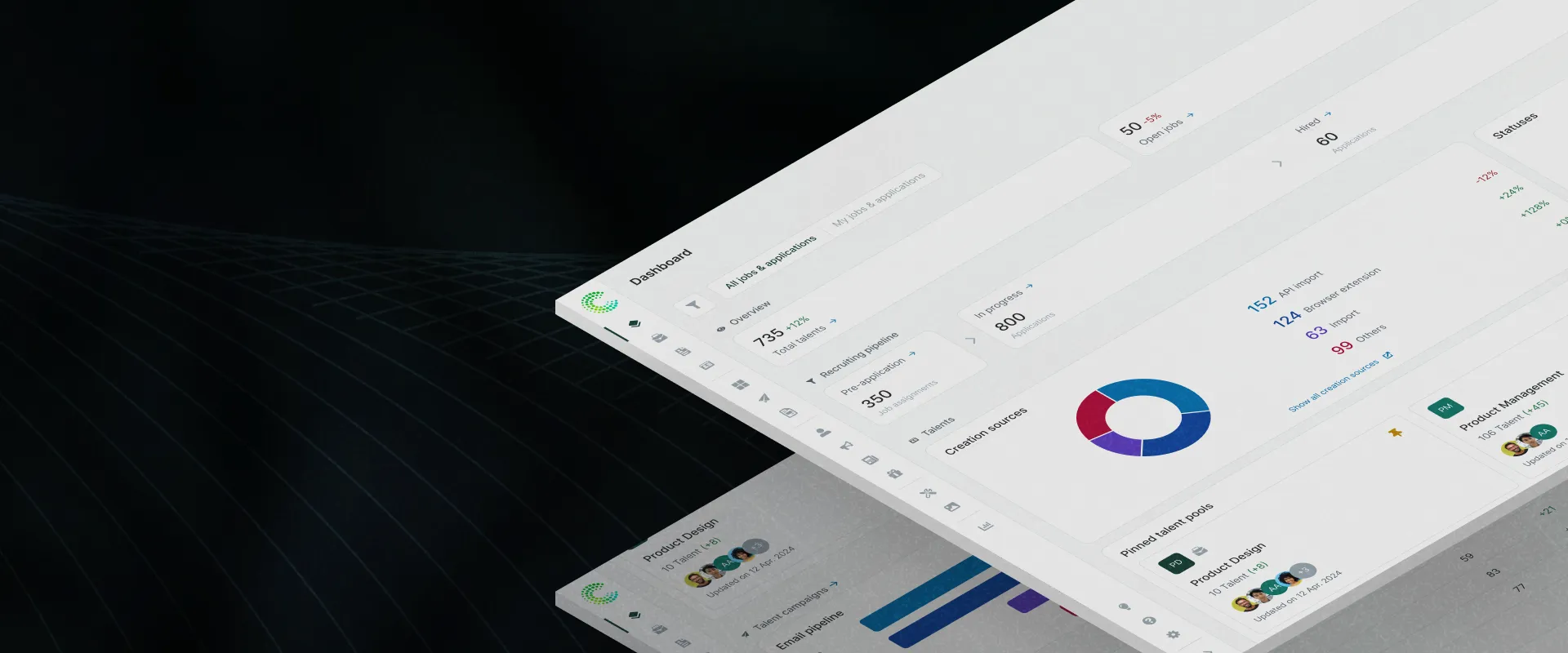
Redesigned recruitment analytics to make data useful and actionable. Smart filters and shortcuts increased engagement 65× and restored platform trust.

New upgrade flow helped users find premium features and boosted conversions 12.7% in 10 weeks