'The Numbers Don't Add Up'
Metrics didn’t match manual counts, destroying confidence in all analytics.
Business Impact:
Users defaulted to manual tracking, ignoring the value of our dashboard

Redesigned recruitment analytics to make data useful and actionable. Smart filters and shortcuts increased engagement 65× and restored platform trust.
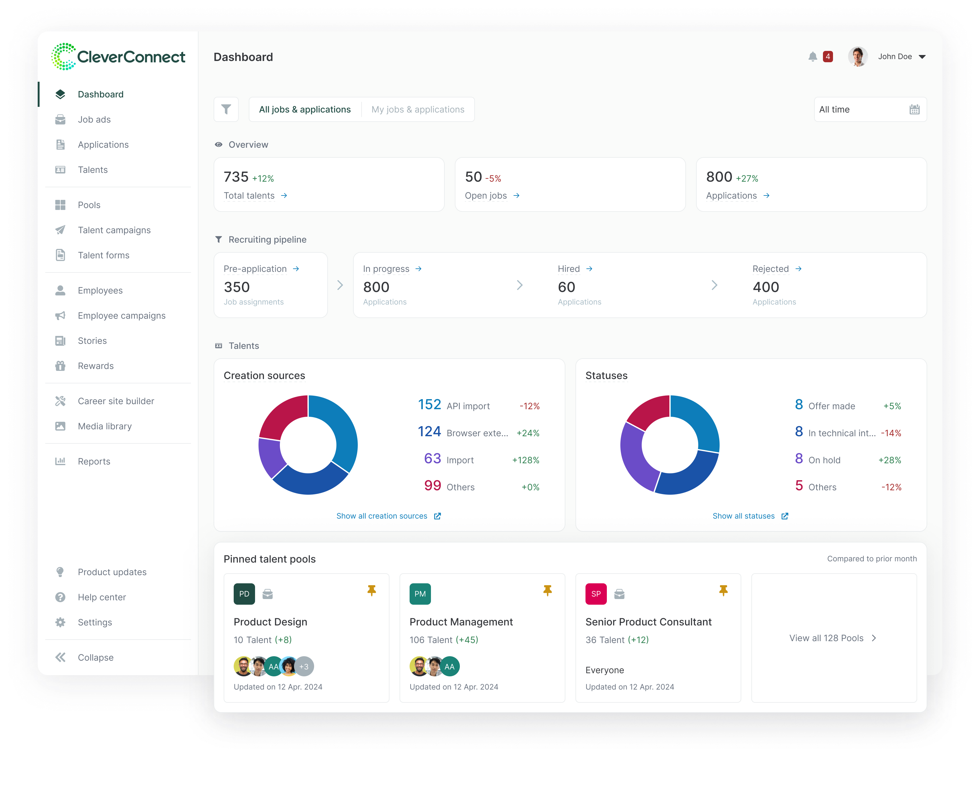
| Problem | Recruiters ignored the dashboard, relying on manual reports and gut feelings instead. This eroded platform trust, increased churn risk, and limited expansion opportunities. |
| Goal | Restore platform trust by making analytics actionable, preventing churn and disengagement |
| Outcome | Over 65× engagement improvement from 0.08% (09/2025–11/2025) to 5.02% (01/2026–05/2026), driven primarily by filters and contextual workflow links; Analytics design framework adopted across product squads. |
| Role | Led end-to-end product design from discovery to post-launch optimization, aligning Design, Product, and Engineering. |
| Timeframe | Q3-Q4 2025 |
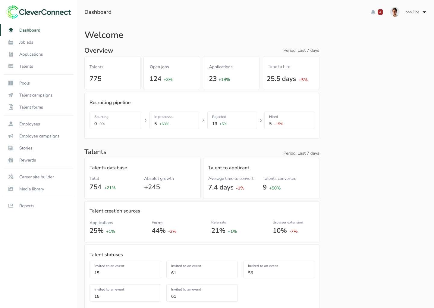
Serving as our platform’s home page, our dashboard was supposed to prove “Hey, look what our platform can do for you!” However, 99% of users ignored it completely. This created some serious issues:
We promised 'powerful analytics', delivered 'meh.'
New users land on dashboard, see nothing useful, bounce
Can't prove value when nobody engages with the data
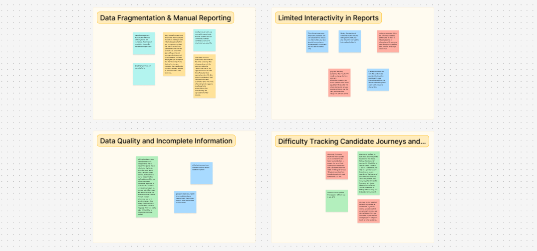
User research and data analytics identified four critical root causes for the 0.08% engagement rate
Metrics didn’t match manual counts, destroying confidence in all analytics.
Users defaulted to manual tracking, ignoring the value of our dashboard
Dashboard didn’t answer questions recruiters were asking (e.g., “apps per job” vs. the needed “apps per source”).
Users fail to see the values they are paying for, risking churn.
Data was “interesting” but not actionable. Users saw a number and didn’t know the next step.
Low engagement made it hard to prove that analytics actually provided value.
No filters meant power users couldn’t answer specific business questions.
Power users churned to competitors with better analytics.
Through cross-functional discussions with Product, Engineering, and Customer Success, we aligned on success criteria and assessed the risks of a major re-launch.
With 0.08% engagement, we had nothing to lose. Convinced leadership to invest 3 months instead of shipping quick fixes.
Leadership wanted AI features. We successfully pivoted the roadmap to data transparency first. Can’t upsell features if users don’t trust your data.
Deprioritized “drag-and-drop” widgets in favor of saved filters to solve the core pain point faster with less dev overhead.
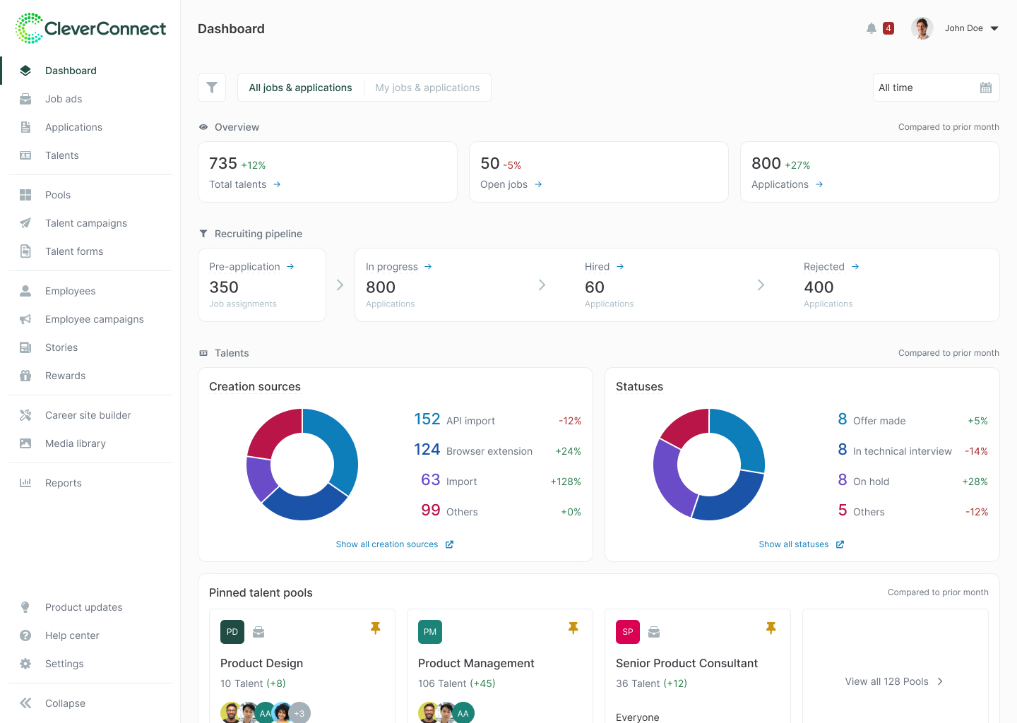
The redesign focused on three strategic pillars:
All metrics must be explainable to build trust and confidence
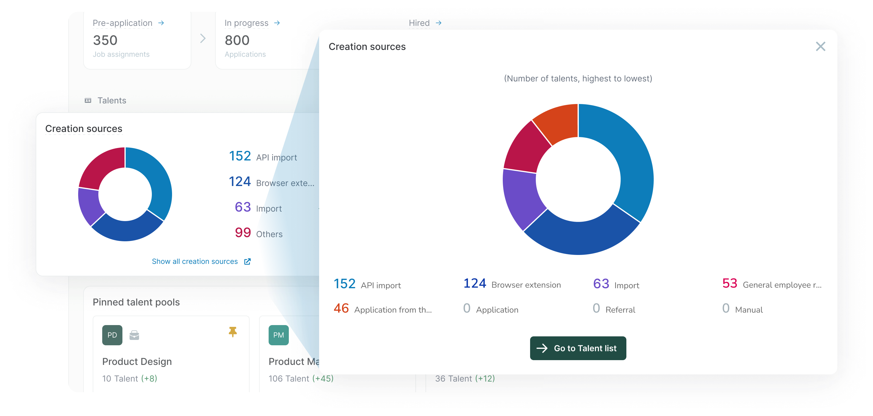
Enable recruiters to filter and segment data according to their specific needs
Analytics must connect to workflows to create a complete user flow
Ranked modules by actual session frequency and a manual audit of custom report requests.
“Must-have” metrics moved to the top, secondary data was grouped below to reduce cognitive load.
Introduced metric definitions via tooltips.
When users said “the numbers don’t match what I counted,” the issue was often that we count these numbers differently. Making these definitions explicit and always accessible restored confidence in the data.
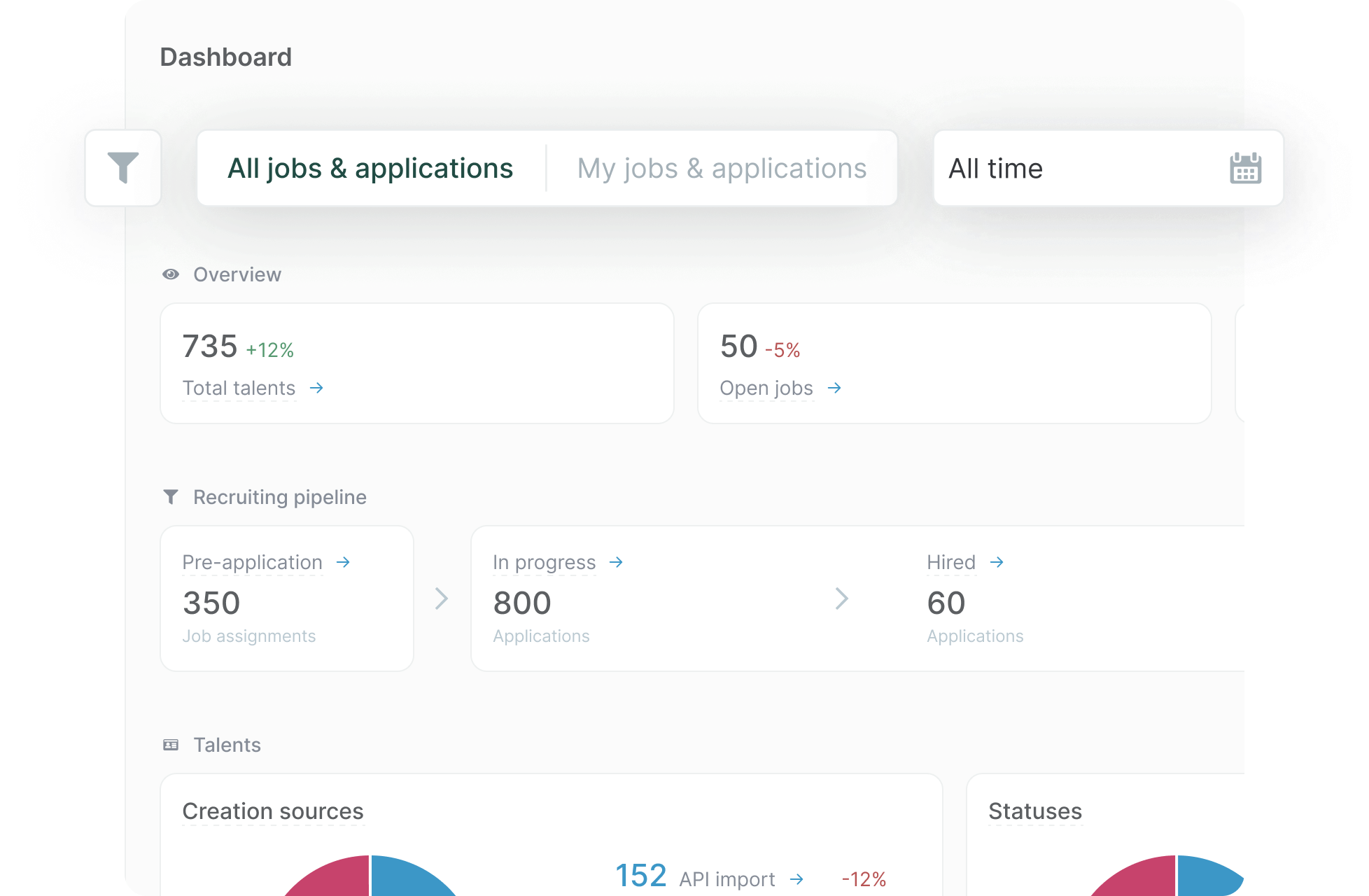
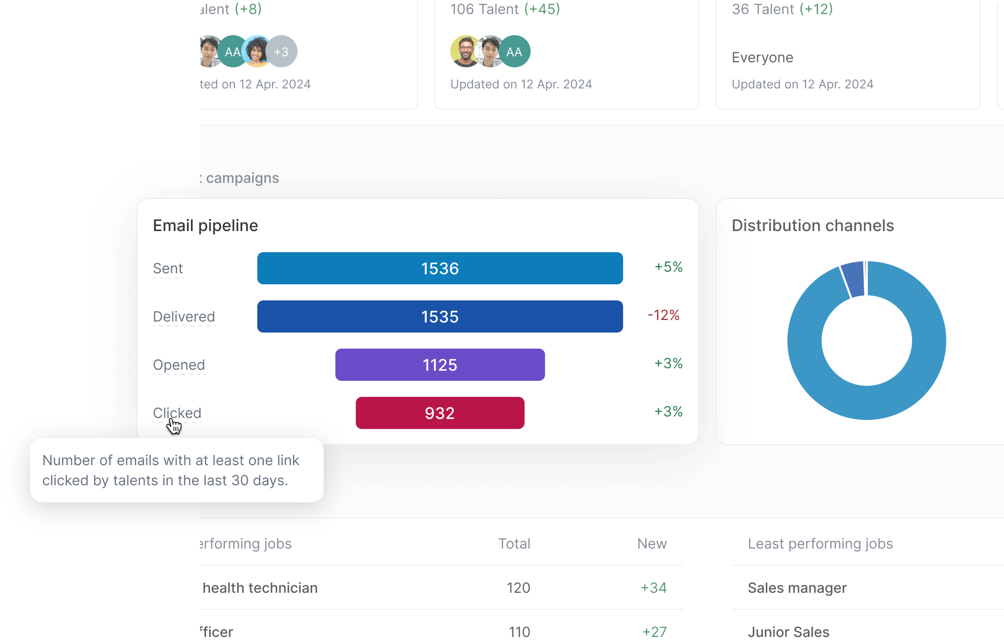
Enabled users to segment data by time, company, department, and more. Automatically saving active preferences in the browser session to reapply them upon their next visit.
Filters directly addressed the “Can’t dig deeper” pain point and became our highest-impact feature. The filter design prioritized speed and clarity: persistent placement, instant application, and consistent with the rest of the platform.
Added skeleton states to provide immediate feedback during backend queries, improving perceived performance.
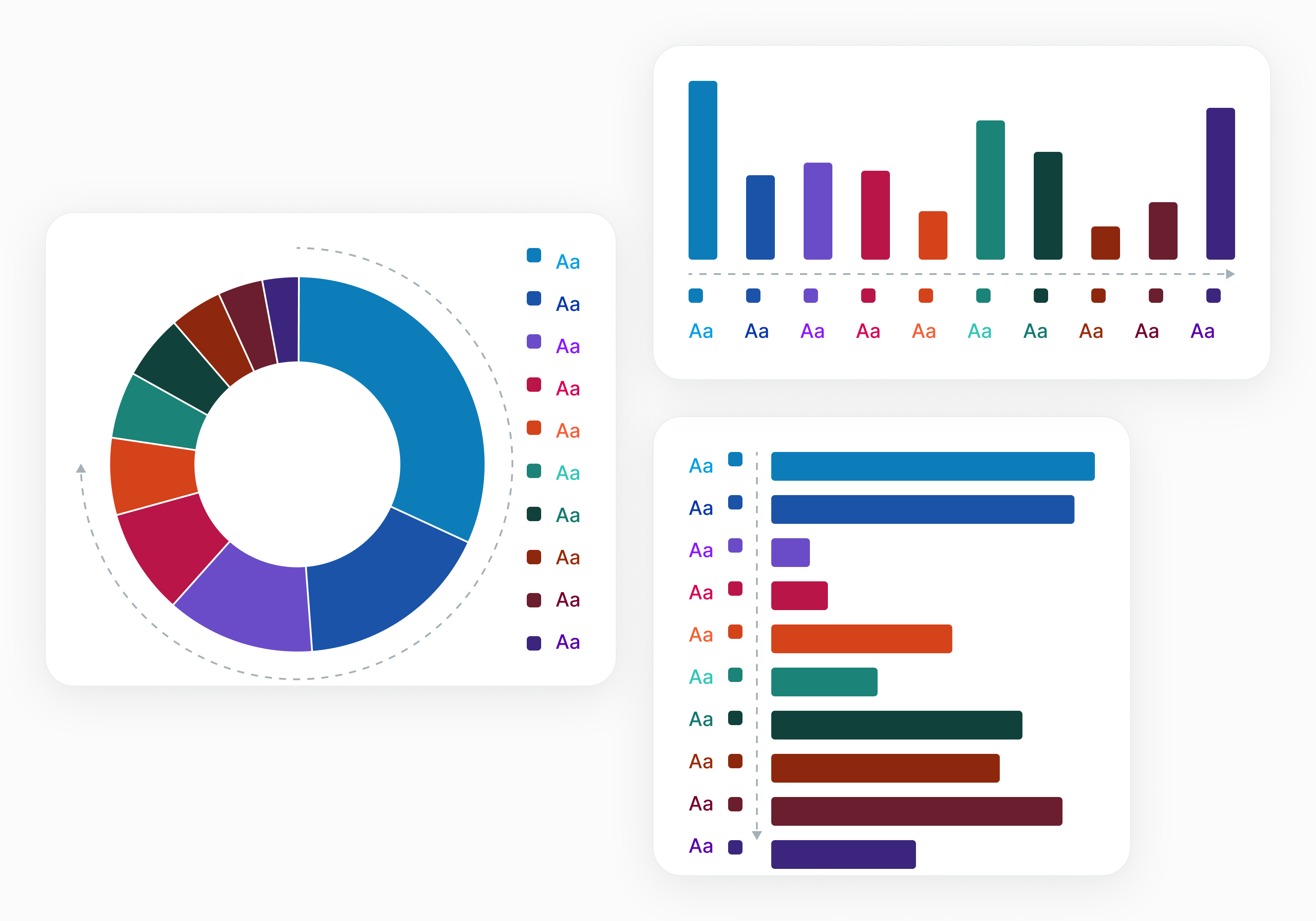
Included visualizations to make insights scannable & signify the big re-release
Besides the functional purpose of making data patterns more scannable, the stark visual change was a psychological reset for users who had spent months ignoring the old dashboard.
Connected KPIs to relevant workflows for deeper analysis
This solved the “Interesting, but now what?” problem. Contextual links transformed passive data consumption into active workflow engagement, making the dashboard a launchpad rather than a dead end.
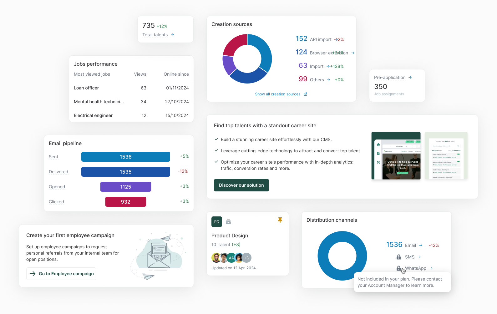
Built reusable components aligned with the design system for scalability
Every chart type, tooltip pattern, and filter component was built as a reusable design system element, so as to ease future dashboard expansion while maintaining consistency.
Increase in active dashboard usage (0.08% → 5.02%).
7.5% of sessions use filters, validating workflow optimization.
Users are exploring the full depth of data, not just the “fold.”
The leap in our click rate was driven by the three core behaviors we designed for: high-level filtering, chart drill-downs, and shortcuts to hiring artifacts. Users were finally seeing data and immediately acting on it.
The new visual / visualizations successfully sparked users’ curiosity. By making the dashboard visually distinct from the “broken” version, we encouraged users to explore the entire page.
My dashboard components are now the org-wide standard, used across 2 product squads.
Introduced quarterly data review and influenced leadership to promote metrics in future product briefs.

How better UX design increased construction bids by 20% and reduced data entry by 11% in B2B SaaS
A redesign case study with positive user feedback and improved design-to-dev handoff.

New upgrade flow helped users find premium features and boosted conversions 12.7% in 10 weeks