Not Starting From Scratch
I already had a Figma library I’d cleaned up and aligned across 2 teams after joining, so this built on existing work rather than starting cold.

Built a framework-independent design system solo with AI-assisted coding, laying the foundation to cut UI regressions and QA effort across product teams.
| Problem | Lack of a unified design system in production: each product app and tech stack maintains its own component library that looks similar on the surface but diverges underneath |
| Goal | A single, framework-independent source of truth for components, layouts, and app frames that can be adopted across teams |
| Outcome | A working, documented component library ready for teams to adopt, built on a Figma design system already unified across 2 teams |
| Role | Sole contributor: design, architecture, build (solo with AI-assisted coding), and documentation |
| Timeframe | 2 weeks, June 2026 |
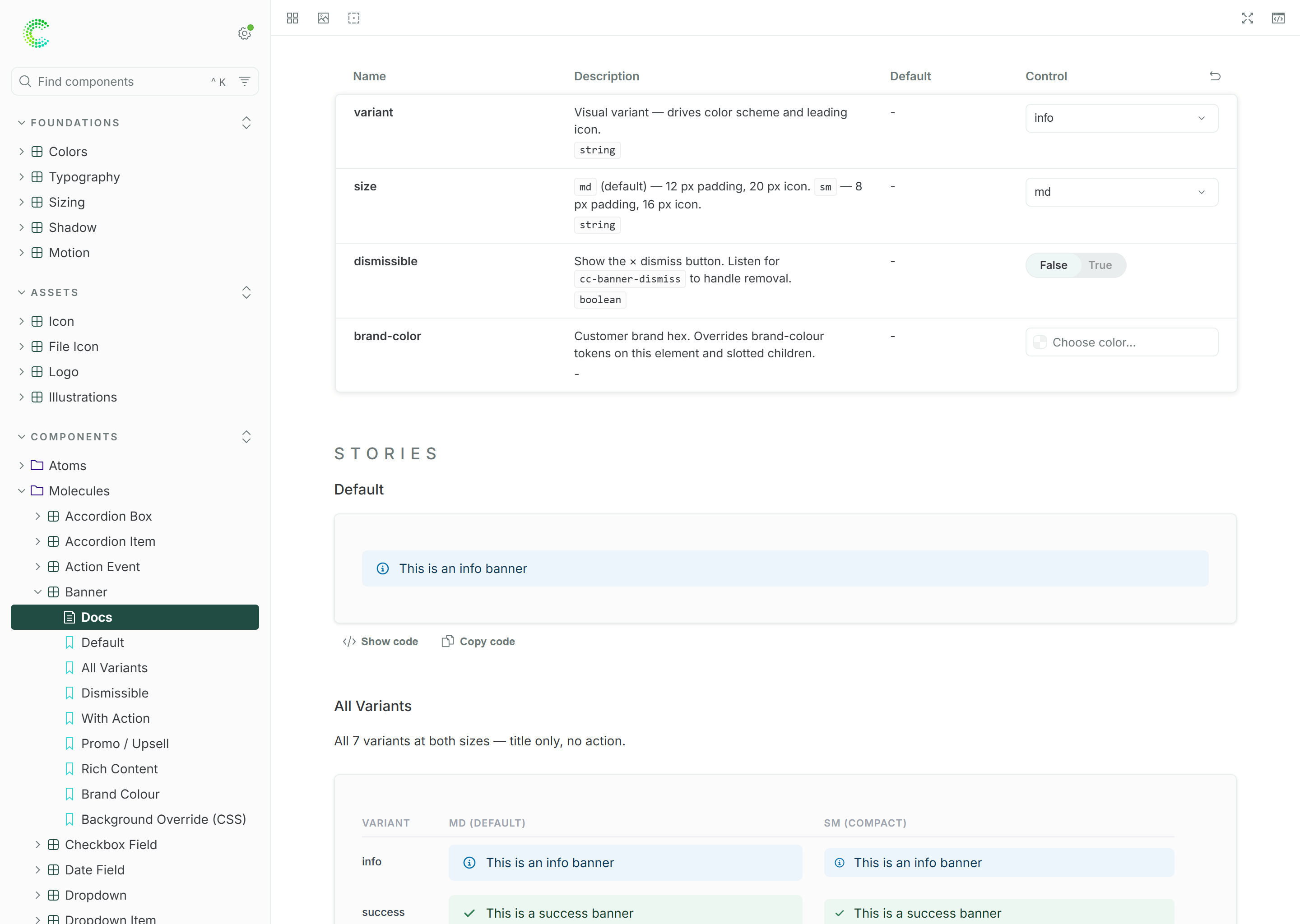
A screenshot of Storybook showing a design system banner component
Every product app had its own component library. Same button, same field, built slightly differently each time, with nothing shared to point back to.
Each app kept a separate library, so components weren't actually shared or reused across teams.
Without one shared system, small inconsistencies piled up and nobody had time to fix them properly.
Engineers often didn't catch UI issues themselves, so even small local changes needed a full manual check before shipping.
The team’s time was mostly going toward other innitiatives or supporting other teams’ work, so this wasn’t going to get dedicated capacity on its own. I built it myself, using AI-assisted coding on top of prior hands-on experience with code and design systems.
I already had a Figma library I’d cleaned up and aligned across 2 teams after joining, so this built on existing work rather than starting cold.
Built as LIT web components, with React and Angular wrappers on top, so teams on different stacks can use the same components instead of rebuilding them.
Storybook is generated from the components themselves, so the docs reflect what’s actually shipped instead of drifting over time.
This is step 1 of a 3-step plan:
Recreate existing UI as a proper, documented design system. Done, solo.
Replace fragmented components, layouts, and app frames in production.
Was planned for Q4, currently on hold.
Less time spent checking unrelated parts of the product for every small change
One place engineering and design can both check what a component actually does
A working demo to show, not just describe, when pitching step 2 (adoption)
A useful reminder that AI-assisted coding can help one person get further with limited time

How better UX design increased construction bids by 20% and reduced data entry by 11% in B2B SaaS
A redesign case study with positive user feedback and improved design-to-dev handoff.

Redesigned recruitment analytics to make data useful and actionable. Smart filters and shortcuts increased engagement 65× and restored platform trust.

New upgrade flow helped users find premium features and boosted conversions 12.7% in 10 weeks