UI-Mental Model Mismatch
The page showed too many options without clear direction, confusing the subcontractors.
Business Impact:
High drop-off rates, users reverting to email/PDF submissions

How better UX design increased construction bids by 20% and reduced data entry by 11% in B2B SaaS
| Problem | Subcontractors abandoned our platform entirely and emailed bids instead, forcing general contractors (our paying customers) to manually enter data, defeating the platform’s core value. |
| Goal | Make it simple for subcontractors to submit complete bids directly on the platform, reducing manual work for general contractors |
| Outcome | 20% increase in bid submissions with completed bills of quantities within 6 months; 11% reduction in manual work for general contractors |
| Role | Led heuristic evaluation, designed and validated solution, created technical handoffs |
| Timeframe | Q4 2022 |
Discovery: Heuristic evaluation, FullStory session recordings, user flow analysis
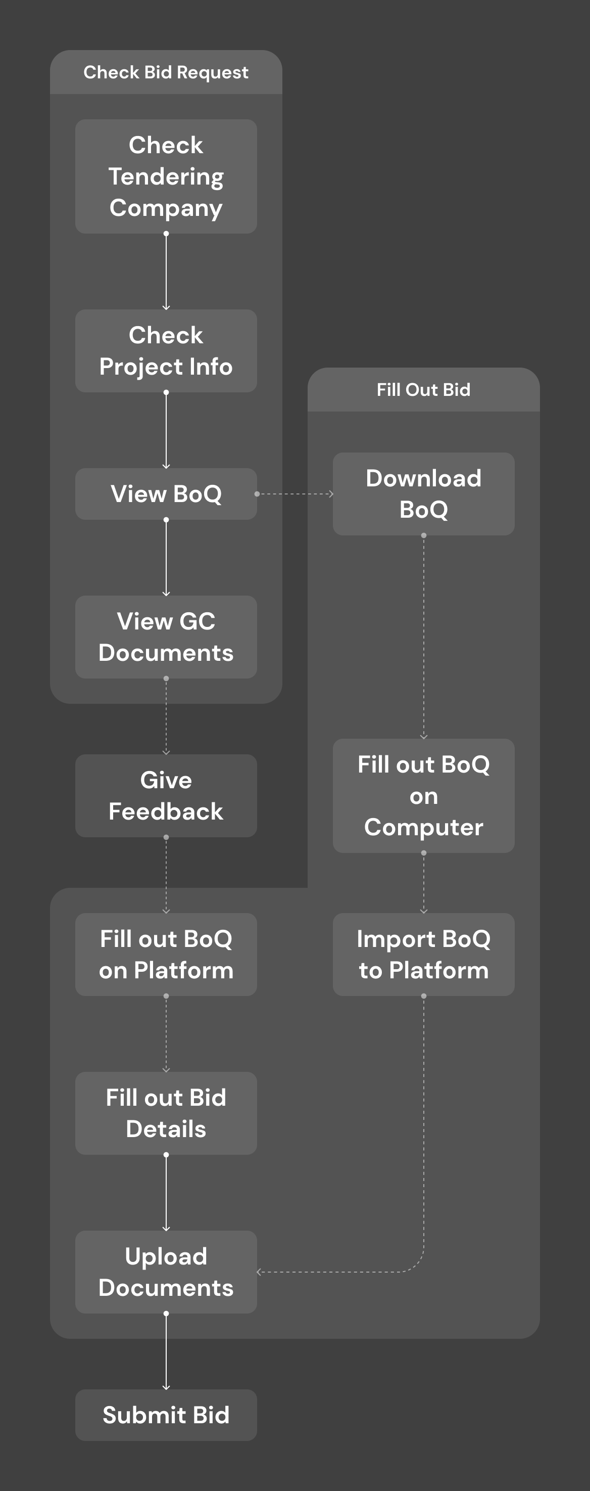
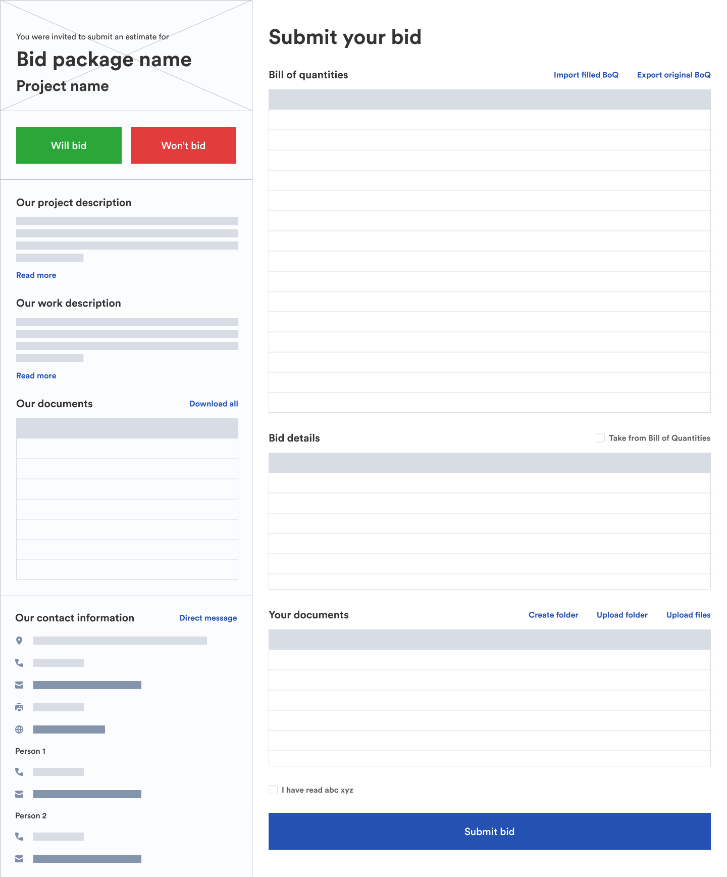
Existing user flow
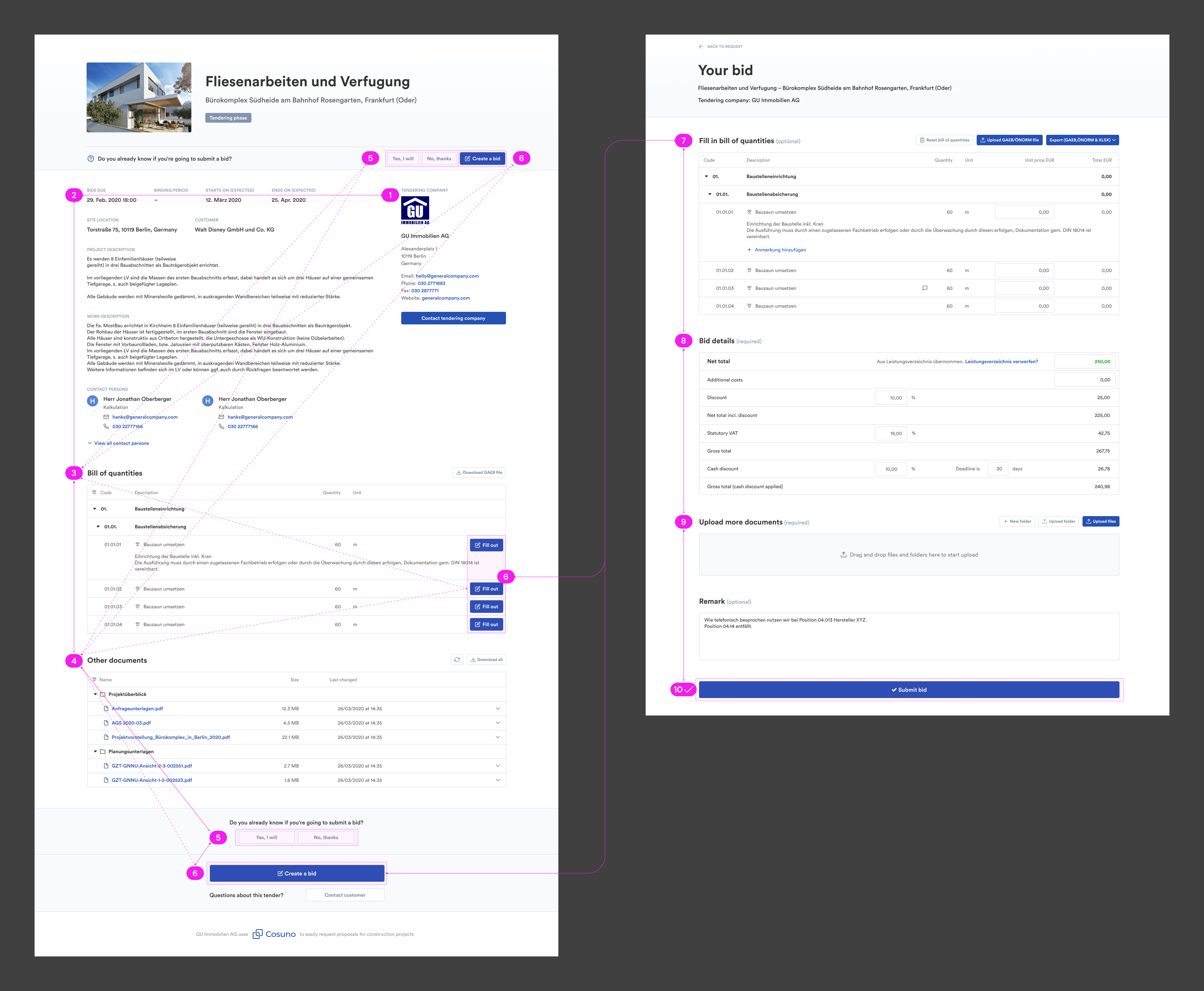
Existing UI
The page showed too many options without clear direction, confusing the subcontractors.
High drop-off rates, users reverting to email/PDF submissions
‘Download Bill of Quantities’ buttons styled as secondary, pushed below fold.
Incomplete submissions, frustrated users contacting general contractors directly
The bid submission form was hidden on a second page, breaking the natural flow.
Low submission rates, general contractors receiving off-platform bids they had to manually import
Through discussions with Product, Design, and Engineering, we reframed the complaints into specific problems we could solve.
Both user types could import bids, but data showed subcontractors were the bottleneck, causing extra work on general contractor’s side. As our paying customers, general contractors were experiencing the pain. Fixing subcontractor UX was actually about protecting general contractor’s value.
→ “The UI hides the submission form and creates unnecessary steps.”
Redirected BoQ filling to desktop (industry standard workflow) while enabling mobile for viewing requests and communication
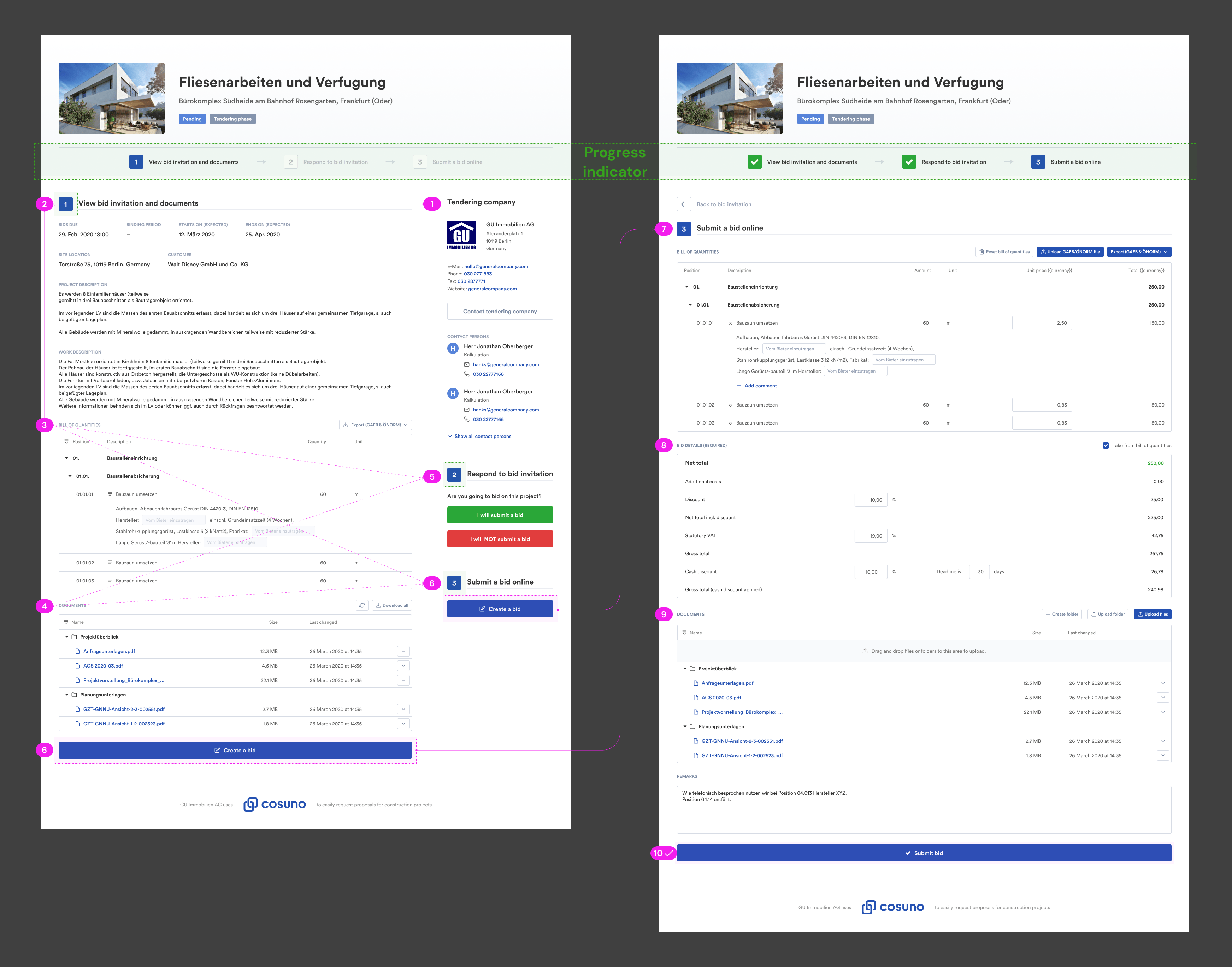
First iteration
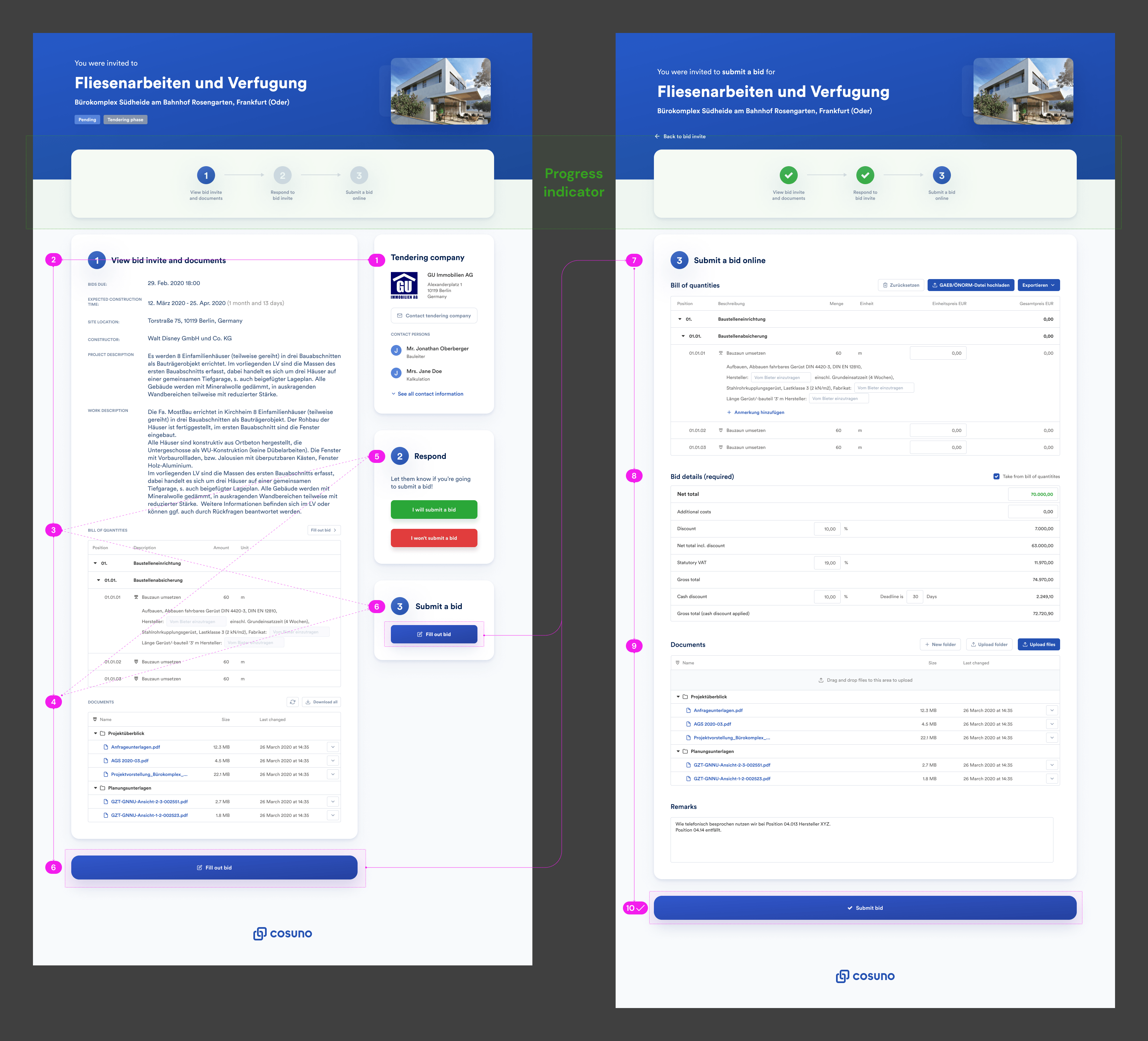
Second iteration
Initial exploration focused on step indicators and progress tracking. User testing revealed this didn’t address the core problem: users couldn’t find the form at all.
Fix the root cause (hidden form, unclear flow) rather than the symptoms
Wireframe
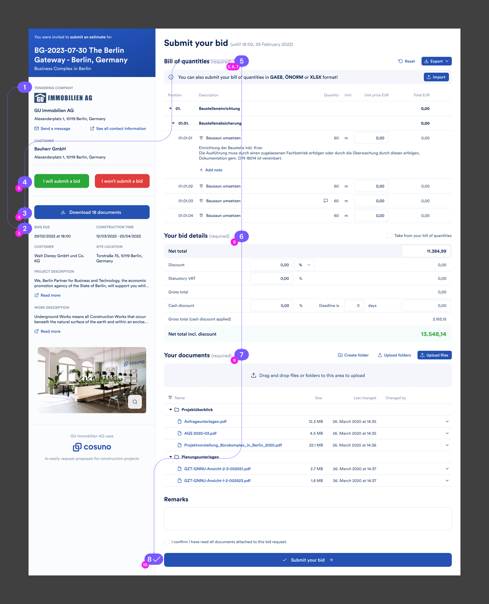
High Fidelity Design
A redesign case study with positive user feedback and improved design-to-dev handoff.

Redesigned recruitment analytics to make data useful and actionable. Smart filters and shortcuts increased engagement 65× and restored platform trust.

New upgrade flow helped users find premium features and boosted conversions 12.7% in 10 weeks