The Talent Acquisition Dashboard is a KPI-focused analytics tool for recruiters at CleverConnect. When I joined, the dashboard had already undergone initial discovery, scoping, and prototyping by a previous team, but had received negative client feedback and suffered from low engagement. With no handover, I was tasked to take over, re-synthesize research, and deliver a new, actionable design direction.
Challenges
Inherited, fragmented project with no handover or overlap
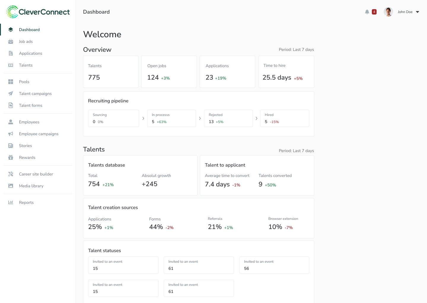
Broken dataset and unclear KPIs
Low engagement (30–40 interactions/month from 60–80 DAUs)
Feedback: lack of filtering, unclear metrics, limited drill-down, and data trust issues
My Responsibilities
Conducted new interviews & synthesized old + new research notes
Documented KPI documentation and metric logic
Finalized scope and validate technical feasibility
Defined success metrics
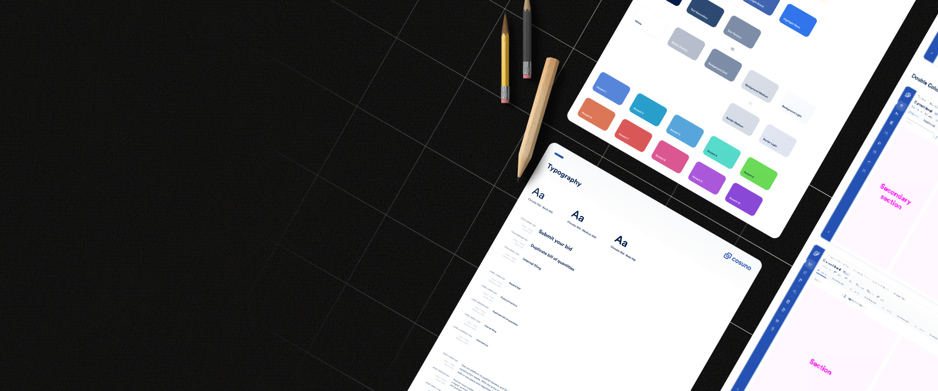
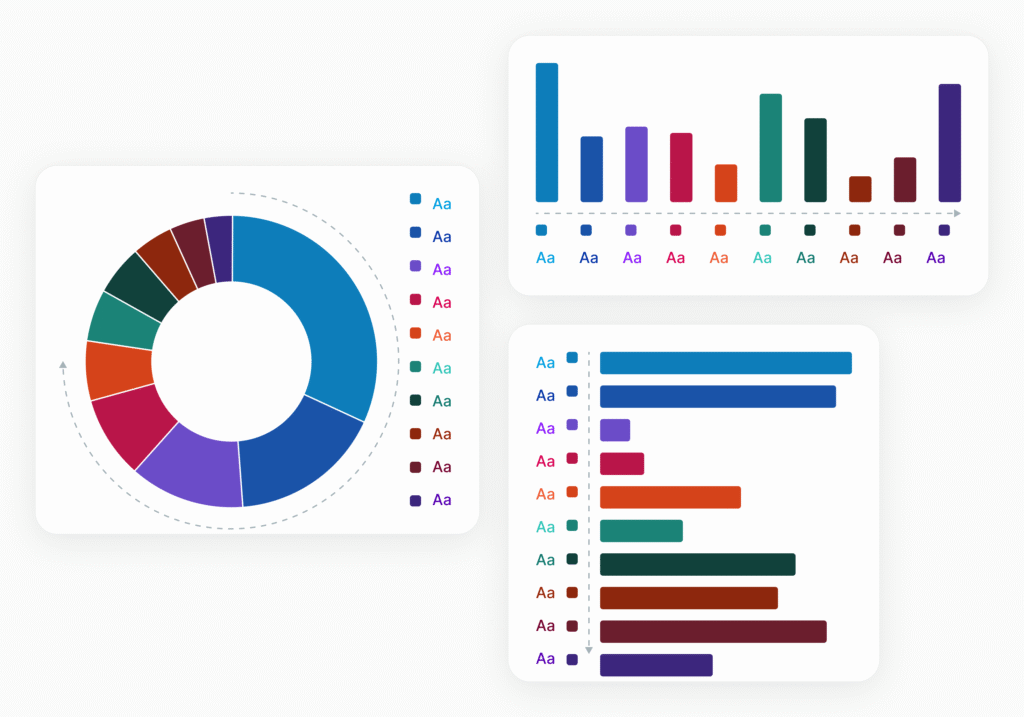
Built reusable Figma components for KPI cards, banners, and filters
Impacts
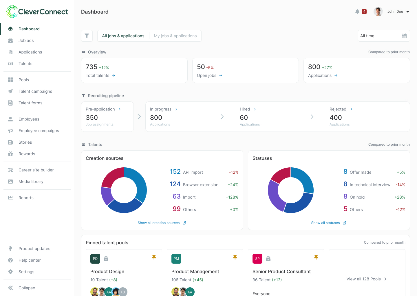
Transformed a static dashboard into a modular, interactive experience that gives recruiters real-time, actionable insights
Set a clear direction for a fragmented project
Implemented a user-centered and data-driven process by integrating user inputs and metrics
1 / 5
Exploration & Discovery
Conducted new interviews with users and stakeholders (customer success managers + account managers)
Resynthesized all available discovery research notes
2 / 5
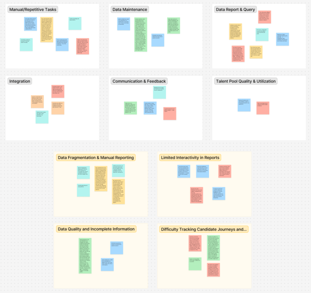
Key Insights
Internal teams struggled with data discrepancies across sources
Users need to filter by company, location, department, and job
Confusion over how KPIs are calculated → data distrust
Inability to drill down or act on data directly from the dashboard
3 / 5
Defining Objectives & Success Criteria
“How might we provide recruiters with actionable and customizable insights to drive daily decisions?”
Query usage data to position KPIs strategically
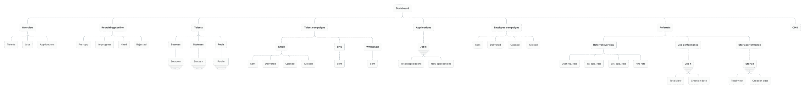
Defined KPIs and information architecture in close collaboration with product, data, and engineering teams
Collaborated with Product Manager and Tech Lead to finalize scope and validate technical feasibility
Defined success metrics
- Time on dashboard page (engagement proxy)
- Number of interactions (filter usage, drill-downs)
- Qualitative feedback from recruiters and CS
4 / 5
Design & Delivery
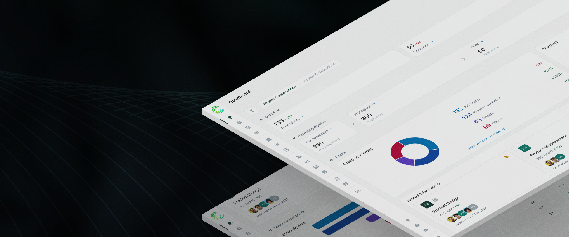
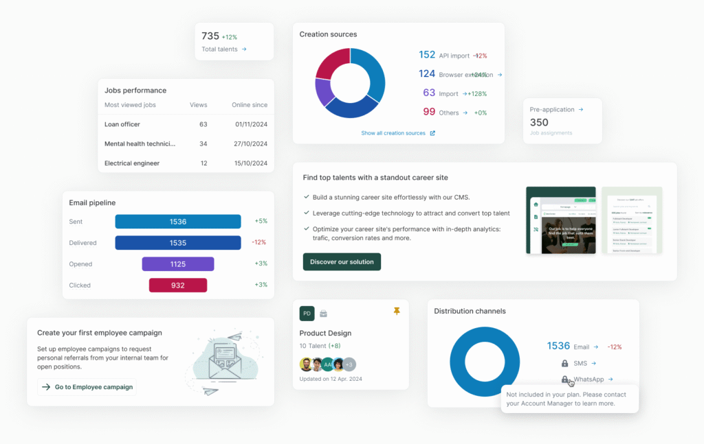
The redesigned dashboard is modular, transparent, and actionable.
KPIs are prioritized for both user value and business impact
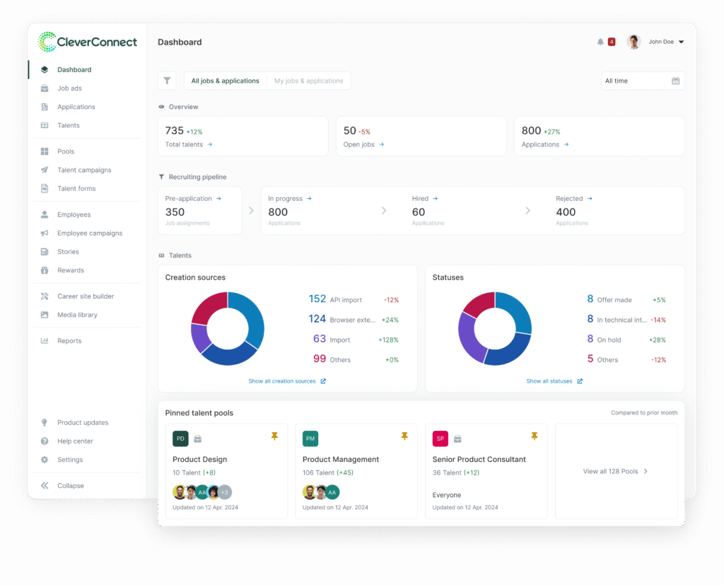
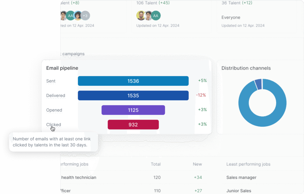
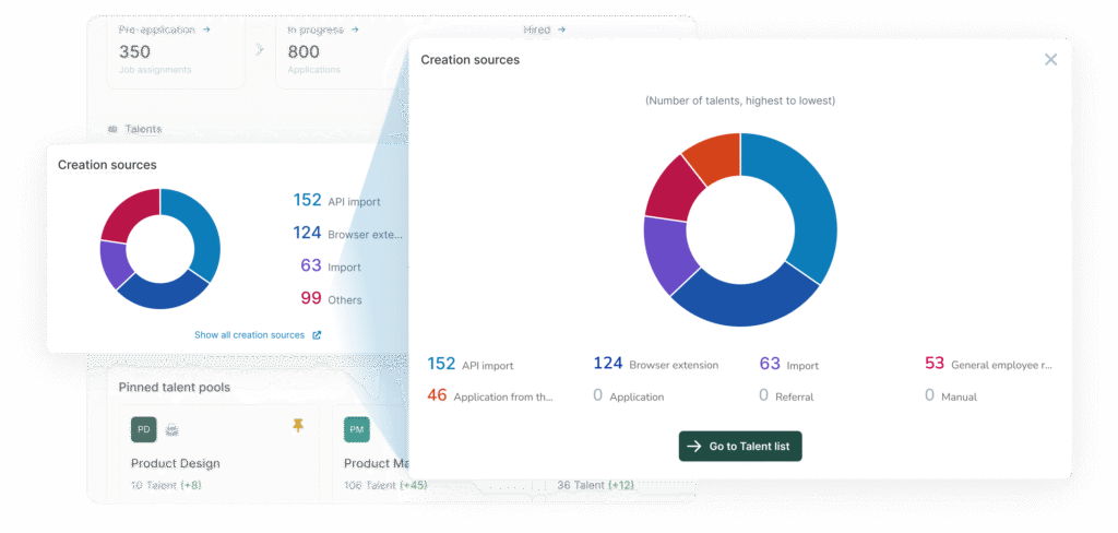
Every metric is explained with tooltips to ensure transparency
Filters allow users to segment data by company, department, and more
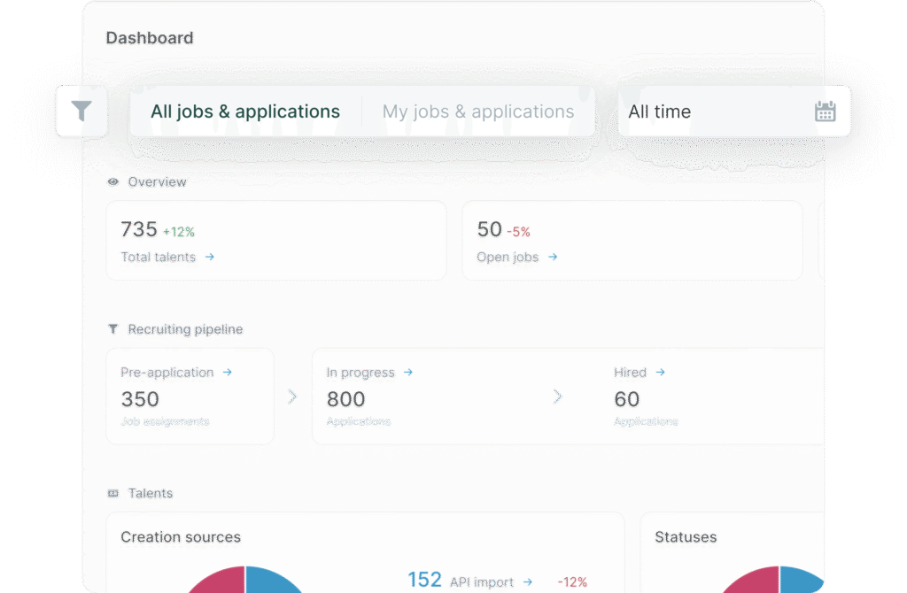
Visualizations make trends and insights easy to spot.
Drill-down links connect KPIs to relevant workflows for deeper analysis.
Reusable Figma component library for scalable design
5 / 5
Outcome & Current Status
The new dashboard is in active development. User-facing results and engagement metrics are pending release
Achieved stronger internal buy-in from cross-functional stakeholders
Established a foundation for future measurement of dashboard adoption and feature engagement post-launch
Key Takeaways – User Experience
Filters and personalized views are critical for relevance and daily use.
Clear explanations of metric logic and consistent data across sources are essential to building user trust.
Communicating actionable next steps is crucial for sustaining user engagement
Key Takeaways – Business
Usage analytics were essential to measure success and focus on what mattered most for users and the business
The pain of reconstructing project context and re-establishing clarity after a non-existent handover could have been avoided by proper, ongoing project documentation
Team & Stakeholders
Maria Henkhaus – Product Manager
Romuald Restout – Chief Product Officer
Benjamin Domenc – Engineering Manager
Andras Szabo – Software Engineer